
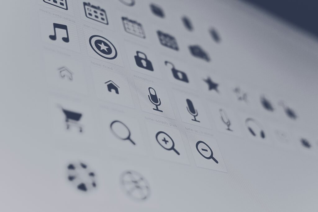
Icons, You’ve seen them, you’ve clicked them, you’ve tapped them. You probably interacted with a few just to get to this page alone.
At a fundamental level, icons are compact images. However, they wield significant influence over user experience, enhancing comprehension and navigation within digital interfaces. Icons streamline screens, making them more efficient, cleaner, and aligned with branding. However, designing an icon involves more than just shrinking an image.
Why are icons important?
Icons might seem modern, but their roots trace back to ancient Greece, where they were used to depict religious figures. With today’s technological advancements, icons have transitioned into the digital realm, where they play vital roles in software and website interfaces. Icons convey meaning and prompt user actions while conserving screen space. Replacing text with recognizable symbols makes navigation simpler and more intuitive.
However, icons must be designed thoughtfully to be effective. Despite their size, poorly designed icons can confuse or deter users. Let’s explore some best practices to ensure your icons stand out for the right reasons.
Icon Design Best Practices
Although modern icons exist in a different context, they’re guided by ancient Grecian principles: simplicity, legibility, and clarity. These principles form the cornerstone of contemporary icon design.
- Determine Purpose: Before diving into design, understand the tasks your icons will represent. List the actions users will take and design icons tailored to each task.
- Use a Grid: Begin with a grid to ensure consistency in size and shape across your icon set. Aligning elements with the grid maintains visual coherence.
- Keep it Simple: Icons should prioritize functionality over artistic expression. Aim for simplicity with enough detail to convey meaning effectively.
- Make it Recognizable: Strike a balance between simplicity and detail to ensure icons are easily recognizable. Conduct research to align your icons with user expectations.
- Aim for Visual Coherence: Maintain consistency in stroke weight, shape, and color scheme across your icon set. Establish rules to ensure a cohesive aesthetic.
- Add Personality: Inject creativity to make your icons unique while aligning with your brand identity. Balance creativity with recognizability to maintain usability.
- Test Your Icons: Validate your icon set through user testing to ensure clarity and effectiveness. Iterate based on feedback to refine your designs.
Resources for Iconic Excellence
Elevate your icon design prowess with these invaluable resources:
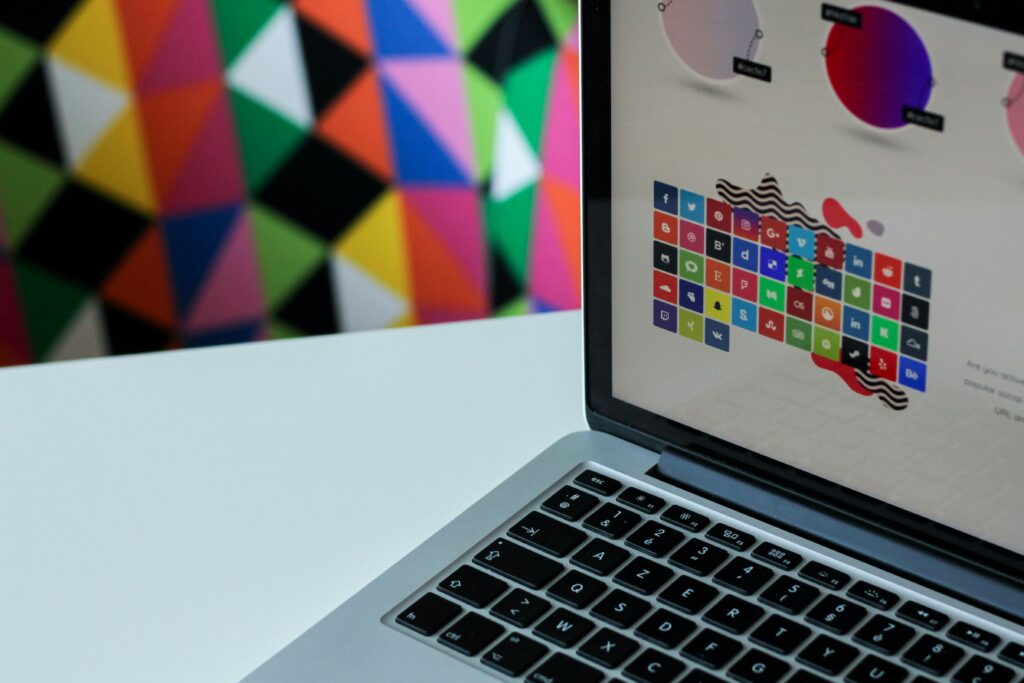
- Material Design: Explore Google’s comprehensive repository of icons, customizable to suit your brand’s aesthetic and functional requirements.
- Streamline Icons: Access a vast collection of pre-designed icons catering to diverse needs, from email symbols to niche industry icons.
- Nucleo: Simplify icon selection and customization with Nucleo’s user-friendly interface, tailored to meet your design workflow needs.
- Animaticons: Add flair to your interface with animated icons from Animaticons, offering a unique user experience that captivates and engages.
- Free Design Resources: Browse an extensive array of icon packs, ranging from iOS tab bar icons to specialty sets, curated for seamless integration into your designs.
Empower Your Users, Elevate Your Brand
In the digital realm, icons serve as silent guides, ushering users through complex interfaces with ease and efficiency. By mastering the art of icon design, you empower users to navigate seamlessly, fostering satisfaction and loyalty. Embrace these principles, unleash your creativity, and embark on a journey toward iconic excellence.
Related Posts:
Difference Between UI and UX Design