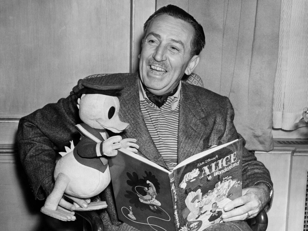
Before “User Experience” (UX) became a recognized field, Walt Disney was already applying its principles in ways that continue to impact design and customer engagement today. Although Don Norman officially introduced the term “UX” in 1995, Disney’s early practices exemplified core tenets of UX design decades earlier. By examining Disney’s methods, we can see how his approach to creating memorable experiences predated—and arguably shaped—modern UX design principles.
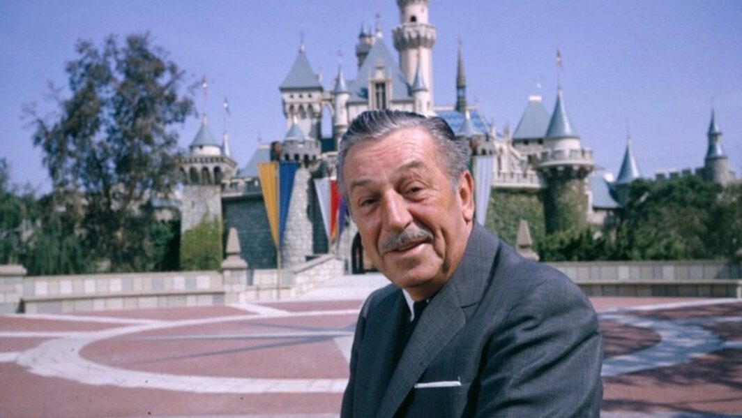
Visionary Focus on User-Centric Design
Walt Disney was a visionary who instinctively placed the user at the center of every creation. He prioritized the overall experience over specific features or technological advancements, ensuring that his work resonated with audiences on a deep level. Rather than following a rigid methodology, Disney relied on a profound understanding of his audience’s desires and expectations. His description of Walt Disney World’s Experimental Prototype Community of Tomorrow (EPCOT) in 1966 captured his belief in constant improvement. Disney envisioned a future where innovation and design would continually evolve to serve and delight people, a concept that resonates strongly with today’s UX designers.
Commitment to Detail and Experience
Disney’s approach was marked by meticulous attention to detail and a relentless drive to enhance every aspect of the user experience. For example, this dedication is evident in the creation of Mickey Mouse, which was Disney’s first feature-length film. Even though the project went significantly over budget and despite Disney needing to mortgage his home to complete it, he remained focused on delivering a top-notch experience. As a result, the film’s success, grossing $8 million internationally, validated Disney’s belief in prioritizing user experience over financial constraints. Consequently, this philosophy of putting the user first remains central to UX design today.
Dedication to Continuous Improvement
Disney’s success stemmed not only from his creative genius but also from his unwavering dedication to refining every aspect of his work. His famous saying, “The key is to always keep moving forward, to make the good better, to continue to improve things, and to strive to make things better,” encapsulates the iterative process that is a hallmark of modern UX design. This commitment to continuous improvement ensured that Disney’s creations were always evolving, staying relevant, and maintaining a high standard of excellence, much like the iterative processes that drive successful UX design today.
Walt Disney’s Enduring Influence on User Experience Design
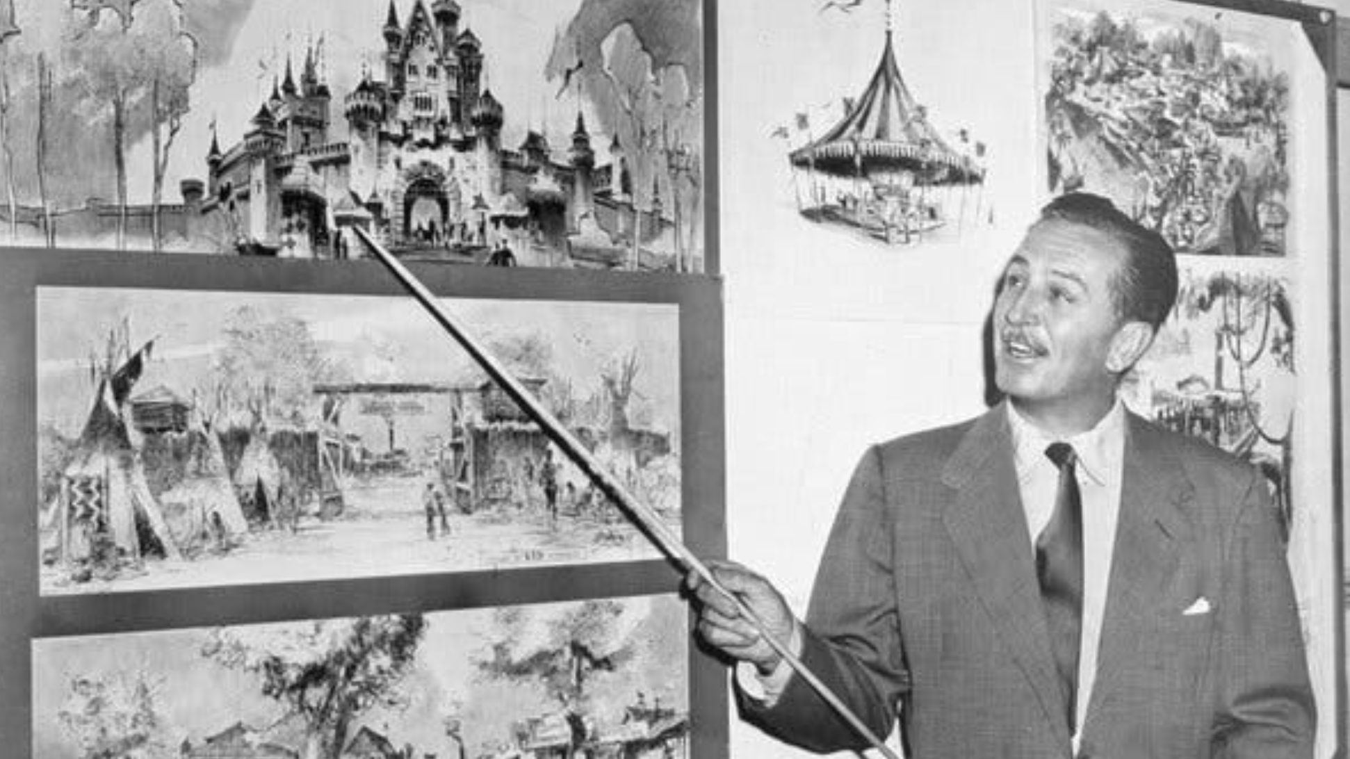
Walt Disney’s influence extends far beyond animation and theme parks into the realm of UX design, where his principles continue to resonate. His work has laid a foundation for what we now consider best practices in UX design, and his ideas remain pioneering in creating engaging, seamless experiences.
Plussing It
Disney embraced a concept he called “plussing,” which involved continuously improving every detail of an experience to surpass expectations. UX designers directly apply this approach by iterating and refining their designs, always asking, “How can this be made better?” This constant push for enhancement ensures that users have the best possible experience, a philosophy that was deeply ingrained in Disney’s creative process.
Storytelling
Disney made a significant contribution to UX through his emphasis on storytelling. In both his films and theme parks, Disney knew that engaging narratives were key to creating emotional connections with the audience. In UX design, this translates to crafting user journeys that are not only functional but also emotionally resonant. By integrating narrative elements into design, UX professionals make digital experiences more compelling and memorable.
Attention to Detail
Disney’s meticulous attention to detail is legendary. Whether designing Disneyland, where every corner was crafted to maintain immersion, or in his films, where even the smallest details contributed to the overall story, Disney understood the power of detail. In UX design, this focus on detail translates to ensuring that every interaction, visual element, and user pathway is polished and purposeful, contributing to a cohesive and satisfying user experience.
Data-Driven Decisions
Long before big data became a buzzword, Disney was using data to inform his decisions—from optimizing park layouts to enhancing guest experiences. Today, using data in UX design is essential. By analyzing user behavior, preferences, and feedback, designers create more personalized and effective experiences, much like Disney did with his innovative use of data in park operations.
Empathy and Human-Centered Design
Disney’s work was always rooted in understanding human emotions and needs. His films connect deeply with audiences because they tap into universal feelings and experiences. In UX design, this translates to a focus on empathy and human-centered design. By truly understanding users’ needs, desires, and pain points, designers can create products that function well and resonate on a deeper emotional level.
Continuous Innovation
Disney’s vision was always forward-thinking, whether through the use of new animation techniques or developing theme park attractions that integrated cutting-edge technology. This spirit of innovation is vital in UX design, where the landscape is constantly evolving. Staying ahead of trends, experimenting with new tools, and being open to creative risks are all ways that Disney’s approach to innovation can inspire UX designers today.
The Benefits of Adding Value
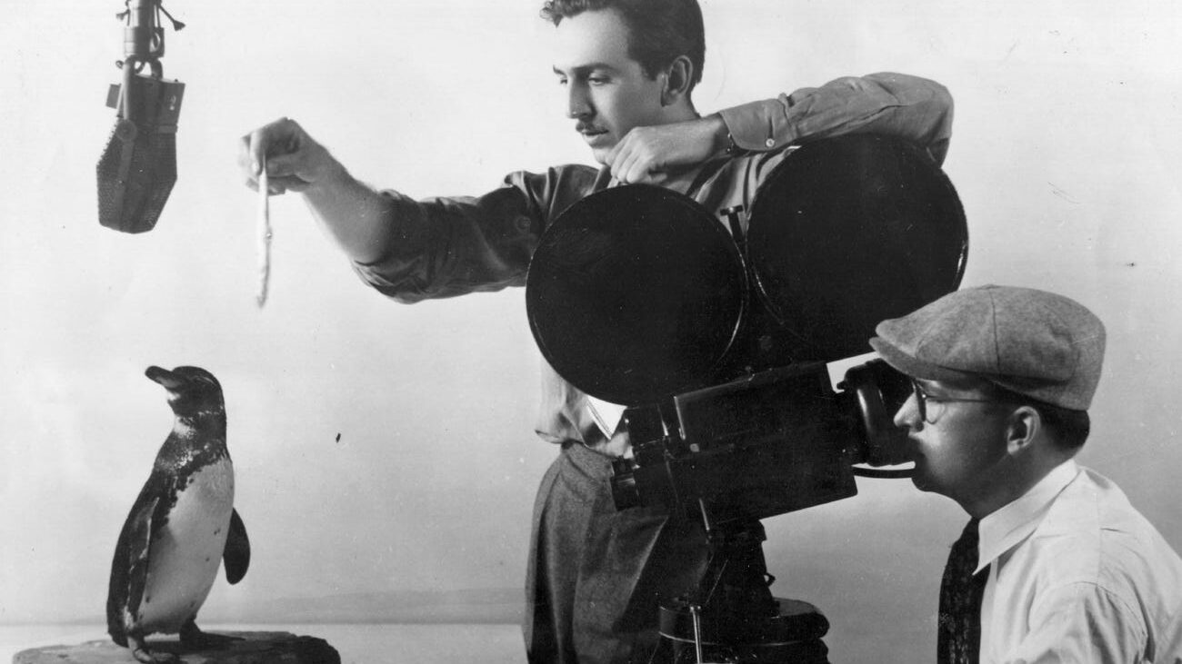
Disney’s focus on enhancing user experiences resulted in a loyal customer base and successful business ventures. For instance, 70% of first-time visitors to Disney theme parks intended to return, showcasing the effectiveness of Disney’s user-centric approach. When the retail landscape evolved with the advent of online shopping, Disney adapted by redesigning its stores to be more interactive and immersive. This transformation not only improved the shopping experience but also led to a 20% increase in profit margins. Moreover, 90% of Disney Store visitors reported feeling a stronger connection to the brand, highlighting the far-reaching impact of a well-crafted user experience.
The 10 Mickey’s Commandments
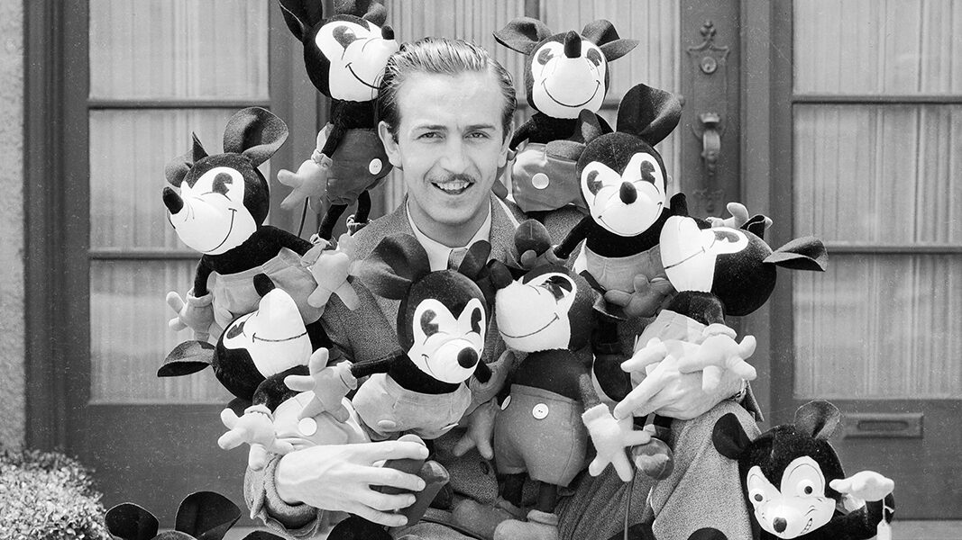
Martin Sklar, one of Disney’s key collaborators, distilled Disney’s approach into “10 Mickey’s Commandments,” which continue to guide designers in creating engaging and meaningful experiences. These commandments are not just practical guidelines but reflect the underlying philosophy that great design is about empathy, storytelling, and clarity.
1. Know Your Audience
Understand the audience deeply. Disney believed in not just entertaining but also respecting his audience, ensuring that the content was engaging and accessible.
2. Wear Your Guest’s Shoes
Experience the design as users would. This practice aligns with modern UX methods, where designers walk through the user journey to identify pain points and opportunities for enhancement.
3. Organize the Flow of People and Ideas
Clear and intuitive navigation was central to Disney’s designs, just like structured user flows in digital interfaces today.
4. Create a Weenie
Disney coined the term “weenie” to describe visual elements that attract and guide users through an experience, similar to modern UX practices that use visual cues to direct user attention.
5. Communicate with Visual Literacy
Disney used color, shape, and texture to convey meaning, which is akin to contemporary visual design principles that rely on non-verbal communication to enhance usability.
6. Avoid Overload
Disney knew that simplicity and clarity were key to an enjoyable experience. This principle is reflected in modern UX design’s emphasis on minimalism and reducing cognitive load.
7. Tell One Story at a Time
Disney emphasized clear and focused storytelling, a precursor to content strategy in UX design, where information is delivered in a digestible and coherent manner.
8. Avoid Contradiction
Consistency in design and messaging was crucial for Disney, just as it is in modern branding and UX, where consistency builds trust and reliability.
9. For Every Ounce of Treatment, Provide a Ton of Fun
Disney focused on creating multisensory and enjoyable experiences, mirrored in UX design’s emphasis on user delight and engagement.
10. Keep It Up
Disney believed in the importance of maintenance and continuous improvement, a principle that aligns with modern practices of iterative design and continuous user feedback.
The Most Important Lesson for Today’s Designers
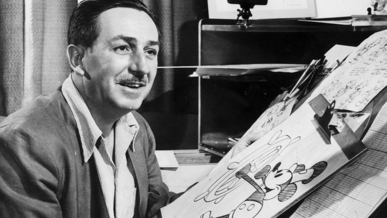
Walt Disney’s legacy powerfully underscores the notion that the essence of UX design lies not in technical proficiency or rigid adherence to methodologies, but rather in the creation of valuable, meaningful experiences for users. Indeed, Disney’s approach was fundamentally user-centric; consequently, he aimed to design and build products that people found useful, valuable, and meaningful. Moreover, this perspective maintains its relevance today, serving as a constant reminder to UX designers that their primary objective is to comprehend and address the needs of their users.
The Evolution of Experience Design
Disney’s influence on UX design extends significantly to the integration of technology and storytelling. For instance, his ability to use technology as a seamless backdrop to enhance the narrative directly mirrors contemporary UX practices. In these practices, technology supports, rather than overshadows, the overall user experience. Additionally, Disney’s use of innovations like the MagicBand clearly demonstrates how technology can streamline and personalize user interactions. Consequently, this approach not only enhances convenience but also deepens the engagement between the user and the experience.
The introduction of MyMagic+, which included MagicBands, therefore marked a significant advancement in guest experience at Disney parks. Furthermore, these wristbands allowed for a more personalized and frictionless visit, thereby exemplifying how thoughtful integration of technology can drastically improve user satisfaction and operational efficiency. As a result, guests could make reservations, unlock hotel rooms, and even make purchases with a simple tap, thus reducing friction and enhancing the overall experience.
Conclusion
Walt Disney’s contributions to design and user experience were groundbreaking; furthermore, they continue to influence UX professionals today. His emphasis on creating immersive, engaging, and continuously improving experiences not only laid the foundation for modern UX principles but also set a standard for excellence. Additionally, Disney’s approach teaches us that, at the heart of exceptional design, lies a deep understanding of user needs and a relentless pursuit of excellence. As we advance in UX design, Disney’s legacy continually reminds us to prioritize the user experience, integrate innovative solutions, and never stop striving to improve. Consequently, his work serves as a timeless example of how to create experiences that resonate deeply with users, ultimately fostering loyalty and enduring success.
Related Posts:
Master UX Design by Integrating Psychology for Superior User Experience
Unveiling the Magic: UI vs. UX Design
The Hidden Wisdom of Winnie the Pooh: A Guide to UX Design
