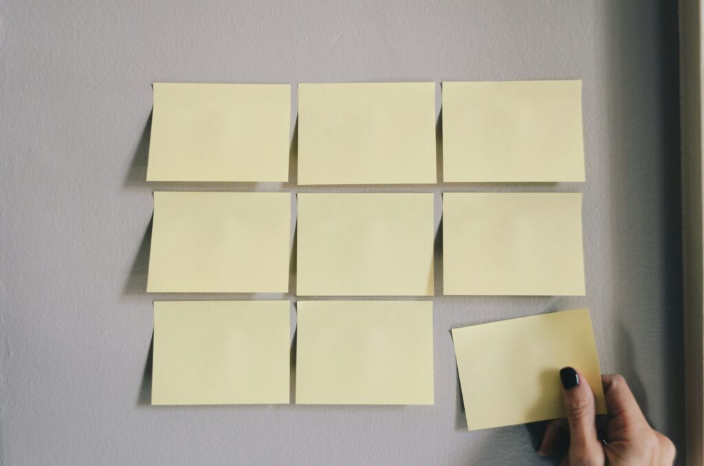
Design is a blend of art and science, where aesthetic appeal meets functional utility. Central to this discipline are principles that guide the creation of effective, engaging, and memorable designs. Among these, Repetition, Pattern, and Rhythm are foundational concepts that help designers create visual consistency, structure, and flow in their work.
Understanding Repetition in Design
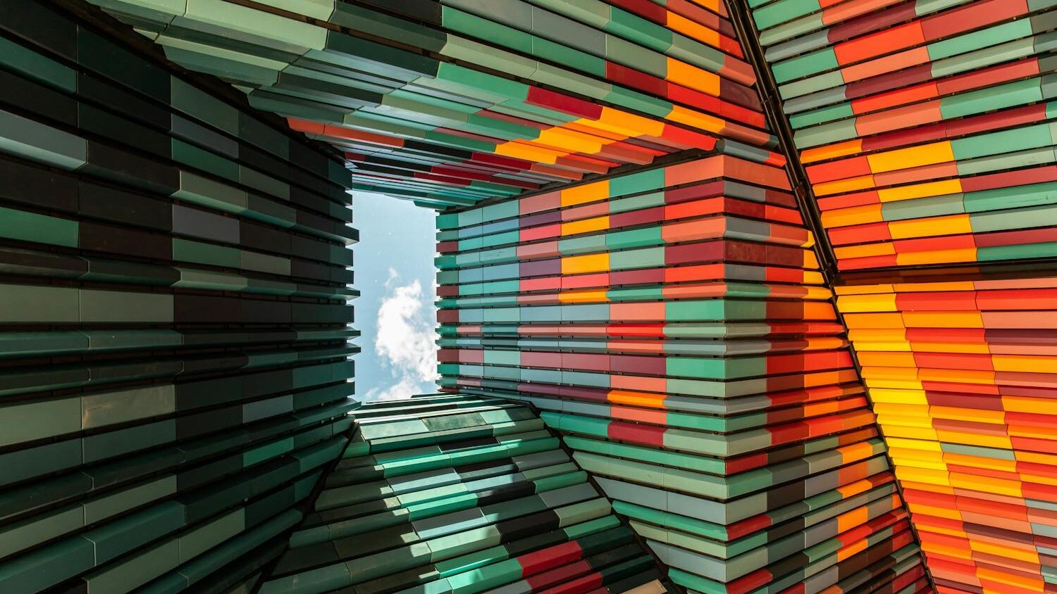
Repetition is a fundamental principle in design that involves using the same or similar elements throughout a project. By repeating certain visual elements, designers can create a sense of unity, continuity, and predictability within their work. This principle is not just about redundancy; it’s about reinforcing the visual identity and making the design more coherent and digestible for the viewer.
Why Repetition Matters
Repetition is crucial in:
- Branding: Brands use repetition to create a strong identity. Designers repeat logos, colors, fonts, and imagery across various media to create a cohesive brand experience. For example, Coca-Cola’s use of its iconic red color and unique script font is a powerful form of visual repetition that makes the brand instantly recognizable.
- User Interface Design: In web and app design, repeating navigation elements, buttons, and icons helps users feel comfortable and familiar with the interface, improving their overall experience.
- Typography: Consistently using the same typeface or style of text can enhance readability and create a more professional and polished look. For instance, using the same heading style throughout a document or website maintains visual consistency.
- Layout and Grids: Repeating layout structures, such as using a consistent grid system, ensures that a design feels orderly and balanced. This is particularly important in editorial design, where a consistent layout across pages helps guide the reader through the content seamlessly.
The Power of Patterns in Design
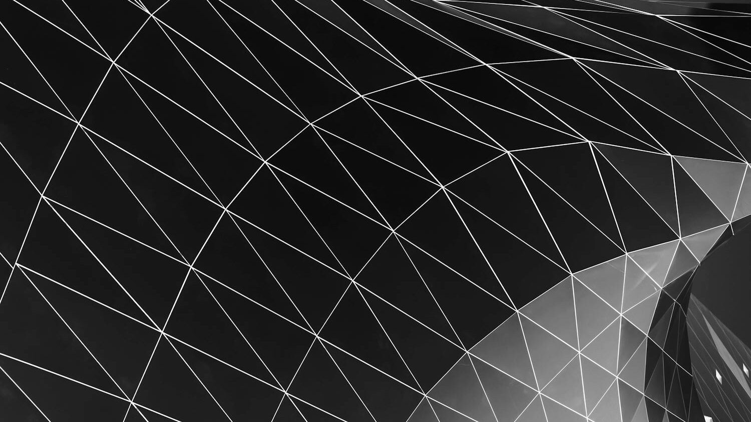
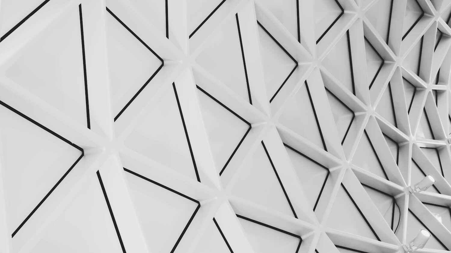
Patterns emerge by repeating a specific arrangement of elements across a design. They can be simple, such as a series of dots or lines, or complex, involving intricate geometric shapes or detailed illustrations. Patterns add texture, depth, and visual interest, making them a versatile tool in a designer’s toolkit.
Types of Patterns
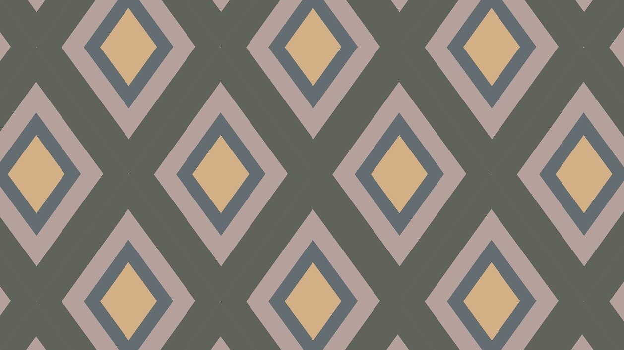
- Geometric Patterns: These are based on precise shapes and mathematical principles. Common examples include checkerboards, stripes, and tessellations. Designers often use geometric patterns in backgrounds or as overlays to add structure and organization to a design.
- Organic Patterns: Inspired by nature, these patterns feature fluid, irregular shapes and forms. Designers commonly use them in textiles and wallpaper to create a natural, relaxing environment. For example, floral patterns are a popular choice in home decor to evoke a sense of calm and beauty.
- Abstract Patterns: These are less literal and more conceptual, using shapes and forms in a non-representational way to create unique and artistic visuals. Designers often use abstract patterns in contemporary art and design to convey emotions or concepts without tying them to specific objects or scenes.
- Textured Patterns: Patterns that mimic textures, such as wood grain, marble, or fabric weaves, add a tactile quality to a design. People often use these to create a more immersive and realistic experience in graphic design.
Applications of Patterns
Patterns enhance various design fields, including:
- Fashion Design: Patterns are integral to fabric design, where they can dictate the style and mood of a garment. Designers like Burberry and Missoni have built their brand identities around iconic patterns.
- Interior Design: Designers use patterns on wallpapers, upholstery, and flooring to add personality and character to a space. For instance, they often choose Moroccan tile patterns to create a bold, exotic ambiance.
- Graphic Design: In print and digital media, use patterns to fill backgrounds, highlight sections, or add texture to flat designs. For example, a subtle pattern can make a flyer or poster more engaging without distracting from the main content.
Creating Effective Patterns
- Consistency: To create a successful pattern, maintain consistency in the elements. Whether the pattern is complex or simple, it should have a coherent logic that makes it visually pleasing.
- Balance: Balance patterns by ensuring an even distribution of elements or by intentionally creating asymmetry to achieve the desired effect. In design, symmetry often provides a sense of calm, while asymmetry can create dynamism.
- Scale and Proportion: The scale of the elements within a pattern can drastically change its impact. Large, bold patterns are eye-catching and dramatic, while small, intricate patterns are more subtle and detailed. Designers need to choose the scale that best suits the purpose of their design.
- Color Harmony: The color scheme of a pattern plays a crucial role in its overall effect. Complementary colors can create a vibrant, energetic pattern, while analogous colors produce a more harmonious and soothing pattern.
The Concept of Rhythm in Design
Rhythm in design is about creating a sense of movement and flow through the repetition and variation of elements. Rhythm closely mirrors its role in music—patterns of beats and pauses create a sense of pace and movement. In visual design, rhythm guides the viewer’s eye across the composition, creating a dynamic experience.
Types of Rhythm
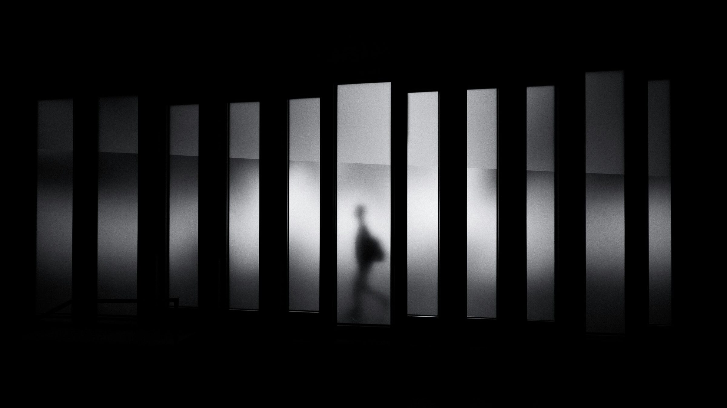
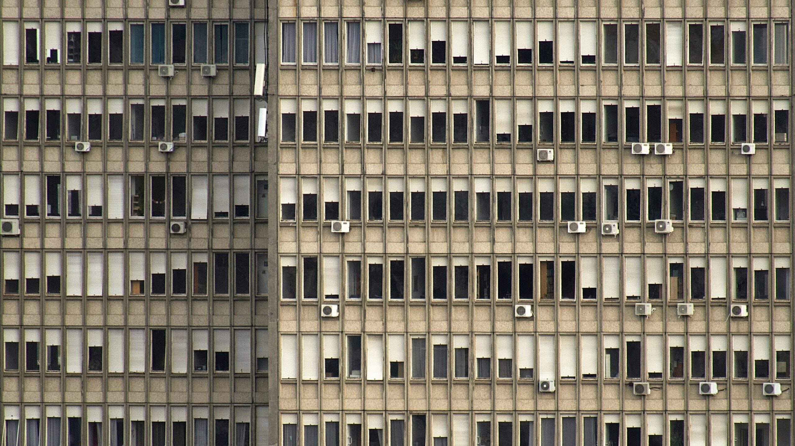
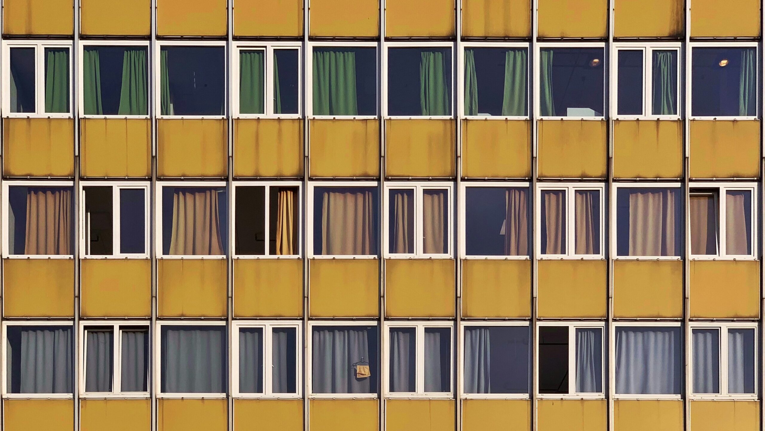
- Regular Rhythm: This type of rhythm uses evenly spaced, identical elements to create a predictable and orderly pattern. It’s like a steady beat in music, providing stability and structure to a design. For example, a series of evenly spaced columns or rows in a grid layout creates a regular rhythm.
- Alternating Rhythm: Alternating rhythm involves two or more elements that repeat in a sequence, creating a sense of progression and variation. This type of rhythm adds interest and complexity to a design, much like a musical rhythm that alternates between different notes or instruments.
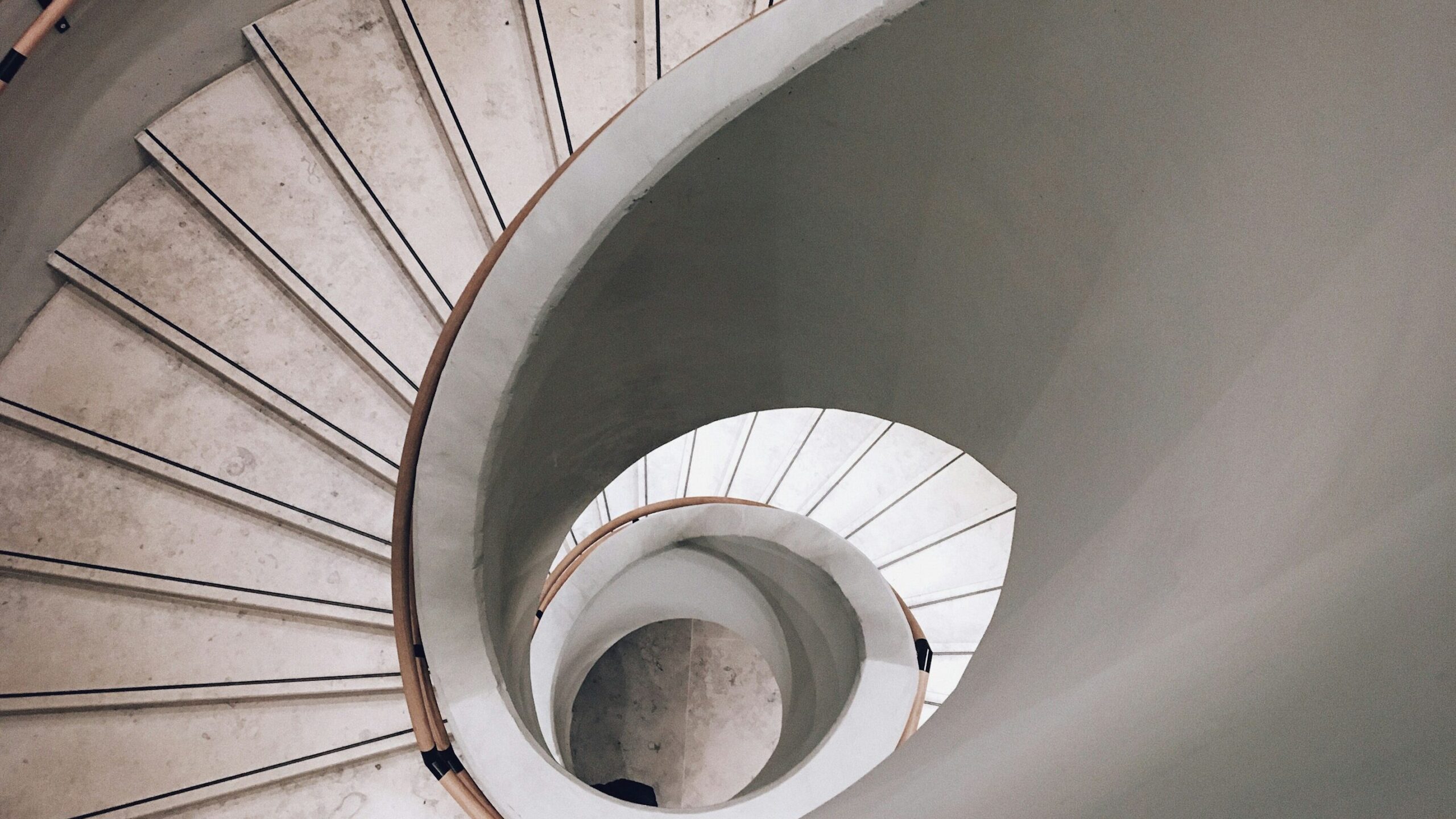
- Flowing Rhythm: Flowing rhythm is more organic and dynamic, often mimicking the natural movement of water, wind, or waves. It’s used to create a sense of movement and guide the viewer’s eye in a smooth, continuous flow. This rhythm is often seen in designs with curved lines or organic shapes that lead the eye naturally from one point to another.
- Progressive Rhythm: Progressive rhythm features a sequence where elements change incrementally, such as increasing or decreasing in size, color intensity, or spacing. This creates a sense of movement and progression, leading the viewer from one part of the design to another. Progressive rhythm is effective in storytelling through design, where each change in the rhythm represents a different stage or aspect of the narrative.
Implementing Rhythm in Design
- Visual Pathways: Rhythm can create visual pathways that guide the viewer’s eye through the design in a specific order. For example, a series of images or text blocks arranged in a flowing rhythm can lead the viewer through a narrative or series of ideas.
- Emphasizing Key Elements: By using rhythm, designers can emphasize certain elements within a composition. Repeated elements can create a focal point, while variations in rhythm can highlight changes or important information.
- Creating Visual Interest: Rhythm adds dynamism and interest to a design. A design with a well-established rhythm feels more engaging and less static, keeping the viewer interested and moving through the content.
- Establishing Harmony and Balance: Rhythm helps to create a balanced and harmonious composition. Whether through regular, flowing, or progressive rhythms, the repetition and variation of elements help to tie different parts of a design together into a cohesive whole.
Practical Applications and Examples
Graphic Design and Layouts
In graphic design, repetition, pattern, and rhythm are used extensively to create cohesive layouts. For example, a magazine might use a repeating grid structure (repetition) to organize content across multiple pages. Patterns might be used in the background to add visual interest, while rhythm can be created by varying the size and placement of images and text blocks to guide the reader through the content.
Web Design
Web design heavily relies on these principles to create intuitive and visually appealing interfaces. Repetition is seen in the consistent use of navigation menus, buttons, and icons. Patterns may be used in the background or as part of the user interface design to add depth. Rhythm is important in guiding users through a website, with elements like image carousels, scrolling text, or alternating section designs creating a sense of flow.
Interior Design
Interior designers use repetition, pattern, and rhythm to create cohesive and inviting spaces. Repetition might be seen in the use of similar furniture pieces or color schemes throughout a room. Patterns can be incorporated through textiles, wallpaper, or tile designs, adding texture and interest. Rhythm can be achieved by arranging furniture and decor in a way that guides the eye through the space, creating a natural flow.
Motion Graphics and Animation
In motion graphics, rhythm is particularly important as it translates directly to the timing and pacing of animations. Repetition of movements or visual elements can create a rhythmic beat, while patterns can emerge from the synchronized movement of multiple elements. Progressive rhythm can be used to build up intensity or lead the viewer through a sequence of events.
Conclusion: Mastering Repetition, Pattern, and Rhythm in Design
Mastering the principles of repetition, pattern, and rhythm allows designers to create work that is not only aesthetically pleasing but also functional and engaging. By understanding how to use these principles effectively, designers can ensure their work communicates clearly, resonates emotionally, and creates memorable experiences for their audience.
Designers should continually practice and experiment with these principles, exploring how different applications can impact the overall effectiveness of their designs. Whether in graphic design, web design, interior design, or any other creative field, the thoughtful application of repetition, pattern, and rhythm can elevate a project from good to exceptional.
Related Posts:
Mastering Typography in UX/UI Design
Using White Space in UX Design: More Than Just Empty Space
Nuances of Color: Exploring the Depths of Color Theory
Dive into Dark Mode, A Game Changer
The Aesthetic-Usability Effect: Balancing Beauty and Functionality in UX Design
