
In today’s digital era, users access websites using a plethora of devices with varying screen sizes. Consequently, responsive design has become a fundamental aspect of web development, ensuring that websites adapt seamlessly to different devices. This extensive guide delves into the principles, benefits, and best practices of responsive design, emphasizing its significance and offering detailed implementation strategies.
Understanding Responsive Design
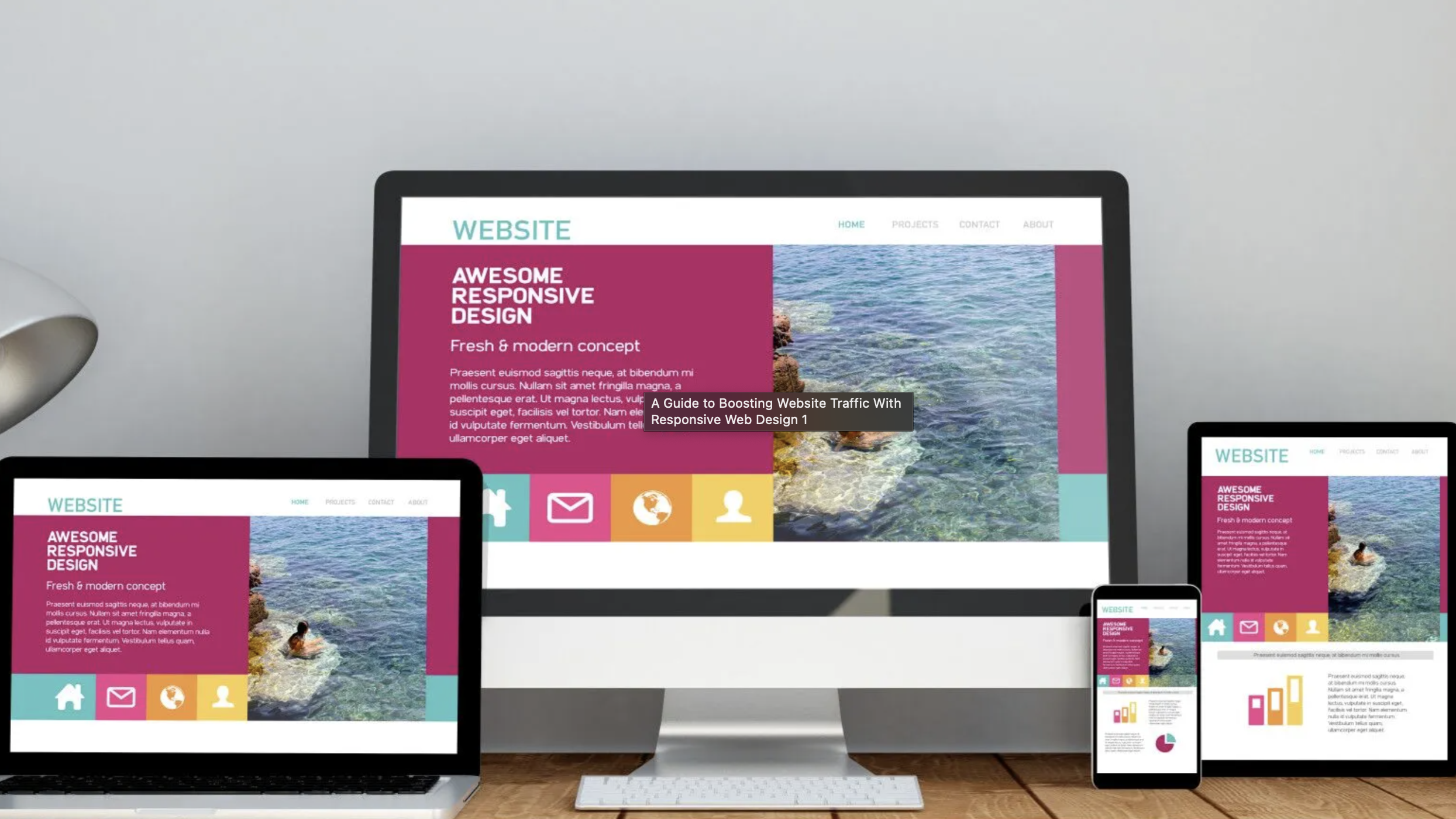
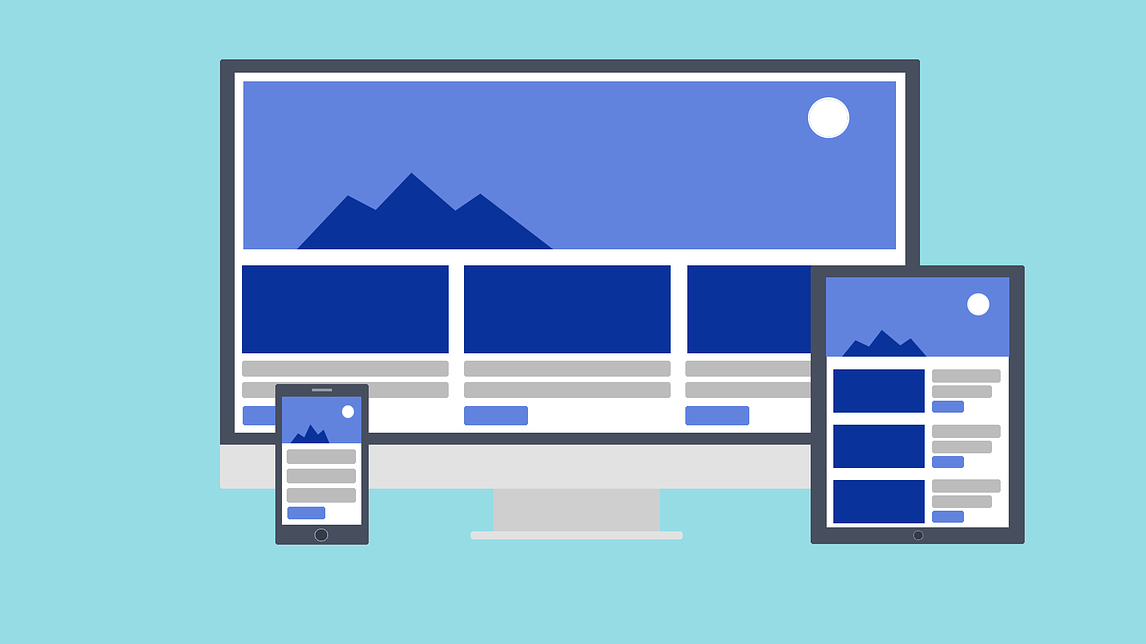
Responsive design is a web design approach that enables websites to adjust their layout and content based on the device being used. This methodology employs media queries and relative units like percentages to ensure that a website’s layout remains flexible and adaptive. By dynamically adjusting design elements to fit the browser space, responsive design maintains content consistency and usability across diverse devices.

Essential Components of Responsive Design
1. Fluid Grid System: A fluid grid system allows design elements to occupy a consistent percentage of space, irrespective of screen size. This scalability ensures that components can adapt as users switch between devices.
2. Fluid Images: In a responsive layout, images must resize dynamically to fit various screen sizes. Fluid images adapt to their container’s size, maintaining quality without distortion. For non-photographic images, using Scalable Vector Graphics (SVG) ensures they remain lightweight and high-quality across different resolutions.
3. Media Queries and Breakpoints: Media queries are CSS techniques that detect the browsing device’s dimensions and adjust the design accordingly. Breakpoints are specific points where the design changes to provide the best user experience. Typically, designers use three primary breakpoints: for desktops (1024px and upwards), tablets (1023px-768px), and smartphones (767px-320px).
Advantages of Responsive Design
- Reaching a Larger Audience: With mobile device usage surpassing desktop usage, having a mobile-friendly website is crucial. Responsive design ensures that your site caters to mobile users, thereby expanding your reach.
- Saving Time and Effort: Instead of creating multiple versions of a website for different devices, designers and developers can focus on a single, adaptable design, significantly reducing development time and effort.
- Improving SEO: Search engines, particularly Google, prioritize mobile-friendly websites in search results. Implementing responsive design enhances your site’s visibility and ranking.
- Ensuring Brand Consistency: Responsive design maintains the integrity of your brand across all devices, ensuring a cohesive and recognizable user experience.

The Evolution of Responsive Design
The surge in mobile internet usage in the early 2010s prompted designers to reconsider traditional web design approaches. Initially, two main strategies emerged:
- 1. Adaptive Design: This approach involved creating multiple versions of a website, each optimized for different devices with fixed dimensions.
- 2. Responsive Design: In contrast, responsive design developed a single, flexible design that adjusted fluidly to fit various screen sizes.
Organizations and designers quickly recognized the benefits of responsive design. This approach gained popularity due to its efficiency and flexibility, allowing designers to create a single design that behaves like a liquid, filling any container it’s placed in.
The Shift to Mobile-First Design
With the increasing dominance of mobile devices, the mobile-first approach became a pivotal aspect of responsive design. This approach prioritizes designing for the smallest screens first and then scaling up. By focusing on mobile users, designers ensure that the most critical elements are prioritized, providing a solid foundation for larger screens.
Best Practices for Implementing Responsive Design
Effectively implementing responsive design involves adhering to best practices that ensure flexibility, performance, and user satisfaction. Here are some essential guidelines:
- Flexible Layouts: Ensure that all elements, including images, text, and components, are flexible and adaptable to different screen sizes.
- Use of SVGs: SVGs are ideal for icons and logos as they maintain their resolution and quality at any size.
- Strategic Breakpoints: Incorporate at least three breakpoints to cover the major device categories—mobile, tablet, and desktop.
- Minimalism: A minimalist design reduces clutter, making it easier for users to navigate and interact with your website. It also enhances load times, which is beneficial for both user experience and SEO.
- Content Prioritization: Use progressive disclosure to prioritize essential content and hide non-critical information, ensuring users have access to the most important elements without being overwhelmed.
- Large Clickable Areas: Ensure that buttons and interactive elements have large clickable areas, enhancing usability and reducing the likelihood of user errors.
- Research Competitors & Industry Leaders: One of the best ways to learn and stay on top of the latest responsive web design trends is by researching competitors and industry leaders.

Common Design Patterns for Responsive Design
Responsive design leverages various design patterns to optimize user experience across devices. Some of the most effective patterns include:
- Column Drop: This pattern allows content to fit into multiple screen types by dropping columns below each other as the screen size decreases.
- Mostly Fluid: This pattern maintains fixed margins while allowing the main content area to adjust fluidly, ensuring a balanced layout across different devices.
- Layout Shifter: This pattern involves shifting layouts dynamically to accommodate different screen sizes, providing a seamless user experience.
- Off-Canvas: This pattern hides less critical navigation and content elements off-screen, revealing them as needed through user interaction, such as clicking a menu icon.

Real-World Examples of Responsive Design
The Guardian
The Guardian exemplifies a masterful approach to responsive design. By prioritizing a mobile-first strategy, the website effectively adapts to various screen sizes while maintaining a consistent brand identity. Key elements like navigation and branding remain prominent across all devices, ensuring a seamless user experience. The desktop version showcases the site’s ability to scale content effectively, offering a richer visual experience without compromising readability.
Smashing Magazine
Smashing Magazine exemplifies responsive design excellence. Its minimalist header, housing the logo, search bar, and menu, ensures clear navigation across devices. The mobile view prioritizes the latest article, using a scroll-based layout for engagement. The tablet version expands the menu, offering additional navigation and sidebar elements. The desktop layout maintains consistency, with a broader view showcasing more content. This strategic approach demonstrates how a responsive design can cater to diverse screen sizes while preserving brand identity and user experience.
Lookout
Lookout prioritizes user experience through responsive design, ensuring key elements like navigation, login, calls-to-action, and search remain accessible across all devices. The website maintains a consistent layout on desktop and tablet, with a prominent call-to-action button. For mobile users, the main navigation is hidden behind a hamburger menu to optimize screen space, while essential elements remain visible. This approach guarantees a seamless user journey across different platforms.

Conclusion
Responsive design stands as a fundamental aspect of modern web development. By ensuring that websites provide an optimal user experience across all devices, responsive design enhances accessibility, usability, and SEO. Adhering to best practices and leveraging flexible layouts, fluid images, and media queries, designers can create websites that are not only visually appealing but also highly functional and user-friendly. The examples of The Guardian, Smashing Magazine, and Lookout illustrate the effectiveness of responsive design in real-world applications, demonstrating its ability to adapt seamlessly to various devices while maintaining content consistency and user engagement.
Related Posts:
Unveiling the Magic: UI vs. UX Design
Master UX Design by Integrating Psychology for Superior User Experience
User Feedback: The Golden Key to Unlocking Digital Success
The Ultimate Guide to Habit-Forming UX Design: Hooked Users with the Hook Model