Design is often perceived as a simple task—translating concepts into visuals, sketching ideas, and bringing them to life digitally. Yet, the truth is far more complex. Great design is not just about making something look good; it’s about making it work effortlessly for the user. At the core of effective design lies the concept of intuition. An intuitive design not only pleases the eye but also guides the user seamlessly, minimizing the need for conscious thought or effort. But what does it mean to be intuitive in design, and how can designers harness this elusive quality?

Understanding Intuitive Design
When we talk about intuitive design, we refer to an interface that feels natural to the user, one that aligns with their expectations and experiences. It’s a design that “just works,” requiring minimal effort to navigate and use. An intuitive interface is one that users don’t have to think about; they simply interact with it, and it responds in a way that feels obvious and straightforward.
Take Slack, for instance—a tool that has revolutionized team communication. The reason Slack’s interface feels intuitive is not by accident. The design is the result of meticulous thought, testing, and refinement. Slack’s success is not just because of its features but also because of its intuitive design. New users can dive in without getting lost, and existing users can navigate its features with ease. This level of intuitiveness is what every designer aims to achieve.
However, intuition in design is a concept that is often misunderstood. It is not something you can design directly. Instead, it is the result of understanding and anticipating the user’s needs, experiences, and mental models. It is about breaking down the idea of intuition into manageable components and designing with those in mind.

The Components of Intuitive Design
1. Responsiveness: Immediate Feedback to User Actions
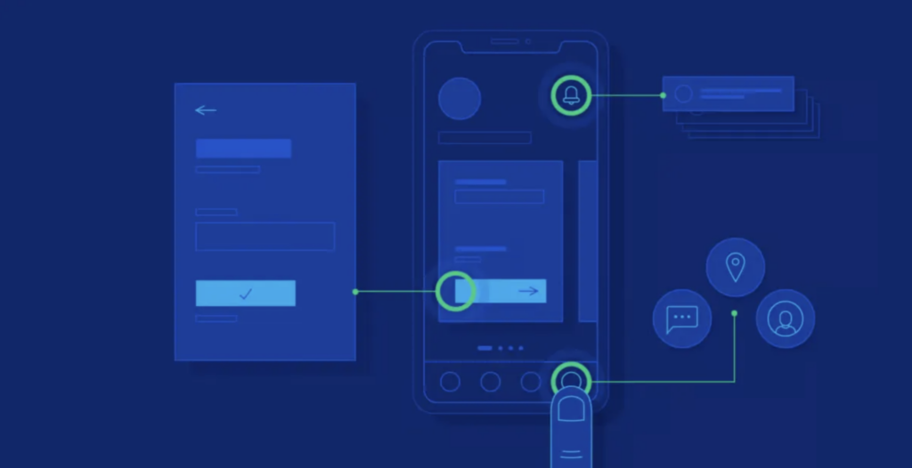
One of the key aspects of an intuitive interface is responsiveness. Users need to know that their actions have been acknowledged and are leading to the expected outcome. When an interface provides immediate feedback—whether through visual changes, animations, or sounds—it reassures the user that they are on the right track. For instance, when you swipe left or right on your smartphone, the screen moves in sync with your finger. This responsiveness feels natural and mimics real-world interactions, making the interface intuitive.
2. Forgiveness: Allowing Users to Make Mistakes
No one is perfect, and users will inevitably make mistakes. An intuitive design is forgiving—it allows users to easily undo actions, recover from errors, and continue without feeling penalized. Google’s search engine is a prime example of forgiveness in design. If you mistype a query, Google often understands what you meant and corrects it. This feature makes the interface intuitive because it aligns with the user’s expectation that the system should help them, even when they make a mistake.
3. Explorability: Guiding Users Without Hand-Holding
An intuitive design encourages exploration without overwhelming the user. It allows users to navigate freely while ensuring they can always find their way back. Good design is about striking a balance between guiding the user and giving them the freedom to explore. In Slack, for example, while the basic functions are immediately accessible, more advanced features are tucked away but easy to discover. This approach ensures that users are not bombarded with options but can explore more as they become comfortable with the interface.
4. Zero Frustration: Ensuring User Satisfaction
The culmination of all these components is a design that leads to zero frustration. When users interact with an interface that responds to their actions, forgives their mistakes, and allows them to explore confidently, they experience satisfaction. They may not consciously recognize why they find the interface enjoyable, but the absence of frustration is a hallmark of intuitive design. It’s this satisfaction that leads to a positive user experience and keeps users coming back.

The Role of Cognitive Load in Intuitive Design
Intuitive design is deeply connected to the concept of cognitive load—the amount of mental effort required to use an interface. When an interface is intuitive, it has a low cognitive load, allowing users to focus on their tasks without being distracted by the need to figure out how to use the interface. The less a user has to think about the mechanics of interacting with a product, the more they can concentrate on the task at hand.
Designing for Low Cognitive Load
Creating an interface with low cognitive load involves several key strategies:
- Guided Interactions: Provide subtle guidance, such as tooltips or onboarding tutorials, to help users get started without overwhelming them with information.
- Consistency: Use consistent visual and interaction patterns throughout the interface. When users encounter familiar patterns, they don’t have to learn new ones, reducing cognitive effort.
- Clarity: Ensure that every element of the design is clear and easy to understand. Avoid jargon and use language that aligns with the user’s mental model.
- Simplicity: Simplify the interface by removing unnecessary elements and focusing on what’s essential. A cluttered interface increases cognitive load and makes the experience less intuitive.
The Balance Between Intuitive and Easy
While intuitive design focuses on aligning with the user’s expectations, easy design aims to simplify tasks and reduce steps. Both approaches are essential but serve different purposes. An easy interface may prioritize efficiency, cutting down on the number of clicks or actions needed to complete a task. However, this simplicity should not come at the cost of usability. A too-simplified interface might lead to confusion if it doesn’t meet user expectations.

Practical Steps to Create Intuitive Designs
To create an intuitive design, designers must engage in a thoughtful and user-centered process. Here are some practical steps:
1. Understand the User’s Mental Model
A user’s mental model is their internal representation of how something works. To design intuitively, you need to understand these models and align your design with them. This involves extensive user research—interviews, surveys, and usability testing. By understanding how users think about and approach tasks, you can design interfaces that feel natural to them.
2. Prioritize Information and Visual Hierarchy
Not all information is equally important. Designers need to establish a clear visual hierarchy, guiding users to what’s most important and helping them navigate through the interface. This hierarchy should be based on both business goals and user needs.
3. Apply Gestalt Principles
Gestalt principles are fundamental to creating a sense of order and predictability in design. Principles like similarity, proximity, and continuity help users understand relationships between elements and predict how the interface will respond.
4. Conduct Heuristic Evaluations
Heuristic evaluations involve analyzing your design against established usability principles, such as those developed by Jakob Nielsen. These evaluations help identify potential usability issues that might disrupt the intuitive flow of the design.
5. Iterate Based on Feedback
No design is perfect from the start. Continuous iteration based on user feedback is essential to refining your design. Usability testing allows you to see where users struggle and adjust the design to better meet their expectations.

The Future of Intuitive Design
As technology evolves, so too will the concept of intuitive design. Advances in artificial intelligence and machine learning will likely lead to even more personalized and adaptive interfaces, where the design anticipates user needs before they are even consciously recognized. However, the principles of intuitive design—understanding the user, reducing cognitive load, and aligning with mental models—will remain foundational.
In a world where users have endless choices, intuitive design is a powerful differentiator. It creates trust, fosters engagement, and ultimately leads to more successful products. By prioritizing intuition in design, we not only make products that are easier to use but also create experiences that users love and return to.

Conclusion: The Art and Science of Intuitive Design
Intuitive design is both an art and a science. It requires creativity to envision interfaces that feel natural and innovative, as well as a deep understanding of human psychology and behavior. By focusing on the user, reducing cognitive load, and aligning with mental models, designers can create products that are not only functional but also delightful to use.
In the end, being intuitive in design is about empathy—putting yourself in the user’s shoes and crafting experiences that resonate with their needs and expectations. It’s a journey of continuous learning, iteration, and refinement. As designers, our ultimate goal is to make technology feel seamless and invisible, allowing users to focus on what really matters—their goals, their creativity, and their satisfaction.
Related Posts:
Comprehensive Guide to Responsive Design
Master UX Design by Integrating Psychology for Superior User Experience
Unveiling the Magic: UI vs. UX Design
