
Dark mode is rapidly evolving, and its impact on UX design is undeniable. As a result, we can expect to see even more innovative features emerge. For instance, imagine interfaces that intelligently adjust color palettes and layouts based on ambient light and user behavior. This would create a truly personalized and intuitive dark mode experience.
Looking ahead, the concept of dark mode may extend beyond screens. With the rise of smart home devices and AR/VR experiences, dark mode UI principles could influence physical environments and digital overlays.
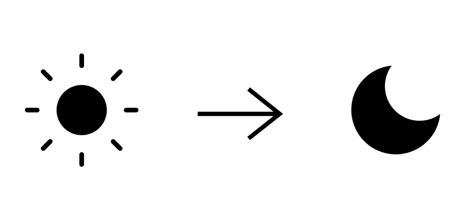
What is Dark Mode UI?
In contrast to the traditional light theme, dark mode offers a display setting that reverses the color scheme. This means light-colored text, icons, and other UI elements pop against black or dark grey backgrounds. By embracing dark mode, you cater to users who prefer a more subdued and eye-friendly interface, particularly in low-light environments.
Why Go Dark? The Benefits of Dark Mode UI
Reduced Eye Strain
While studies have shown dark mode to alleviate eye strain, a frequent complaint for those glued to screens, the benefits extend further. The lower light emission inherent to dark interfaces creates a more comfortable viewing experience, particularly for users who spend long hours in front of their devices. Research even suggests it can minimize symptoms like stinging eyes, blurred vision, headaches, and neck pain.
Enhanced Visibility in Low Light
For users working at night or in dimly lit areas, dark mode offers a significant advantage. Consequently, reduced screen glare makes content easier to read and navigate. Imagine, on the other hand, trying to read an article on a bright white screen in a dark room – not exactly a pleasant experience. Dark mode eliminates this issue entirely, allowing users to comfortably consume content regardless of the ambient light.
Improved Accessibility
Dark themes are a boon for users with visual impairments or sensitivities to bright light. High-contrast interfaces created by dark mode can significantly improve readability for people with conditions like macular degeneration or cataracts. Furthermore, dark mode can also be beneficial for users with migraines or light sensitivity. By reducing overall screen brightness, dark mode makes digital interactions less taxing on their eyes.
Increased Focus
Furthermore, dark mode minimizes visual distractions, allowing users to sink into the content at hand. The muted color palette, in turn, reduces eye strain and eliminates bright elements that might compete for attention. This translates to a significant advantage for tasks that require concentration, such as reading long documents or working on complex projects.
Battery Efficiency
On devices with OLED screens, dark mode translates to lower power consumption. OLED (Organic Light-Emitting Diode) screens illuminate individual pixels, meaning fewer pixels are lit up when using a dark interface. This can lead to extended battery life, a crucial factor for users on the go. Studies estimate that dark mode screens can consume up to six times less power compared to their light-mode counterparts.

Aesthetics and Brand Image
Dark interfaces can evoke a sense of sophistication and elegance. They can project a modern and minimalist aesthetic, which resonates with many users. Additionally, dark mode can be a way to reinforce your brand identity through the use of specific color palettes. Imagine a news app with a dark theme that emphasizes the seriousness of the content, or a meditation app that uses calming dark tones to create a sense of tranquility.
Designing for Darkness: Best Practices for Dark Mode UI
- Embrace Dark Grey, Not Pure Black: While black backgrounds create a dramatic effect, pure white text on black can be harsh on the eyes. Opt for dark grey backgrounds and slightly desaturated white for text. This creates a more balanced contrast that is easier to read for extended periods.
- Tone Down Vibrant Colors: Saturated colors can appear jarring against dark backgrounds. Consider toning them down or using a more muted color scheme. Imagine a social media app with a dark theme – bright red notifications would likely overwhelm the user. Opt for a darker shade of red or a different color altogether to maintain visual harmony.
- Maintain Color Contrast: Accessibility guidelines are your best friend when it comes to dark mode contrast ratios. Tools like Accessible Colors can help you ensure optimal color combinations for readability. Following accessibility guidelines ensures your dark mode interface is usable by everyone, regardless of visual ability.
- Leverage Light for Hierarchy: Shadows, a mainstay in light mode UI, become less effective in dark themes. Use variations in light intensity to create depth and hierarchy between UI elements. Lighter shades can represent foreground elements that require immediate attention, while darker tones can be used for background elements.
- Offer a Light Mode Option: Provide users with the flexibility to choose between light and dark modes. This caters to individual preferences and ensures accessibility for everyone. Some users may have visual impairments that make dark mode difficult to use, while others simply may prefer the look and feel of a light theme.
- Test, Test, Test: Rigorously test your dark mode design in different lighting conditions. Ensure optimal user experience across various
Going Beyond the Basics: Advanced Dark Mode Strategies
- Dynamic Dark Mode: Take dark mode a step further by implementing dynamic adjustments based on the time of day or user preferences. Imagine an e-reader app that automatically switches to dark mode at sunset, creating a seamless transition for nighttime reading.
- Context-Aware Dark Mode: Tailor the darkness of the interface based on the content being viewed. For instance, a photo editing app might switch to a darker mode when displaying images, while using a lighter mode for editing menus and tools.
- Smart Inverted Colors: While dark mode typically inverts the entire interface, consider a more nuanced approach. Implement a system that inverts specific elements while leaving others untouched. This can be particularly useful for apps with complex layouts or heavy use of media.
- Embrace Haptic Feedback: In mobile apps, leverage haptic feedback to enhance user interaction in dark mode. Subtle vibrations can confirm button presses or menu selections, providing valuable feedback in low-light situations.
- Educate Your Users: Don’t assume everyone understands dark mode. Provide clear instructions on how to enable and customize dark mode settings within your app or website. This ensures users can take full advantage of its benefits.

The Future of Dark Mode
Dark mode is rapidly evolving, and its impact on UX design is undeniable. As technology progresses, we can expect to see even more innovative dark mode features emerge. Here are some exciting possibilities:
Adaptive Dark Mode
Imagine interfaces that intelligently adjust color palettes and layouts based on ambient light and user behavior. This would create a truly personalized and intuitive dark mode experience.
Dark Mode for the Future
The concept of dark mode may extend beyond screens. With the rise of smart home devices and AR/VR experiences, dark mode UI principles could influence physical environments and digital overlays.

Embrace the Dark Side: A Conclusion
By understanding the benefits of dark mode UI and implementing these best practices, you can create user experiences that are not only functional but also comfortable and visually appealing. In a world increasingly dominated by digital screens, dark mode offers a valuable tool to enhance user experience and cater to a wider audience. So, don’t be afraid to embrace the dark side – it might just lead you to a brighter UX future!
produce winning products time and again. Its principles of flexibility, continuous improvement, and customer-centricity make it an ideal approach to navigating modern business challenges in the ever-evolving design landscape.
Related Posts:
Unveiling the Magic: UI vs. UX Design
Integrating Psychology for Superior User Experience
Content Design: The Language of User Experiences