
While the core principles of Color Theory in Design provide a solid foundation, there’s a whole world of subtleties waiting to be explored. Here, we delve deeper into the intricacies of color, venturing beyond the basics to unlock its full potential in design.
Understanding Color Context
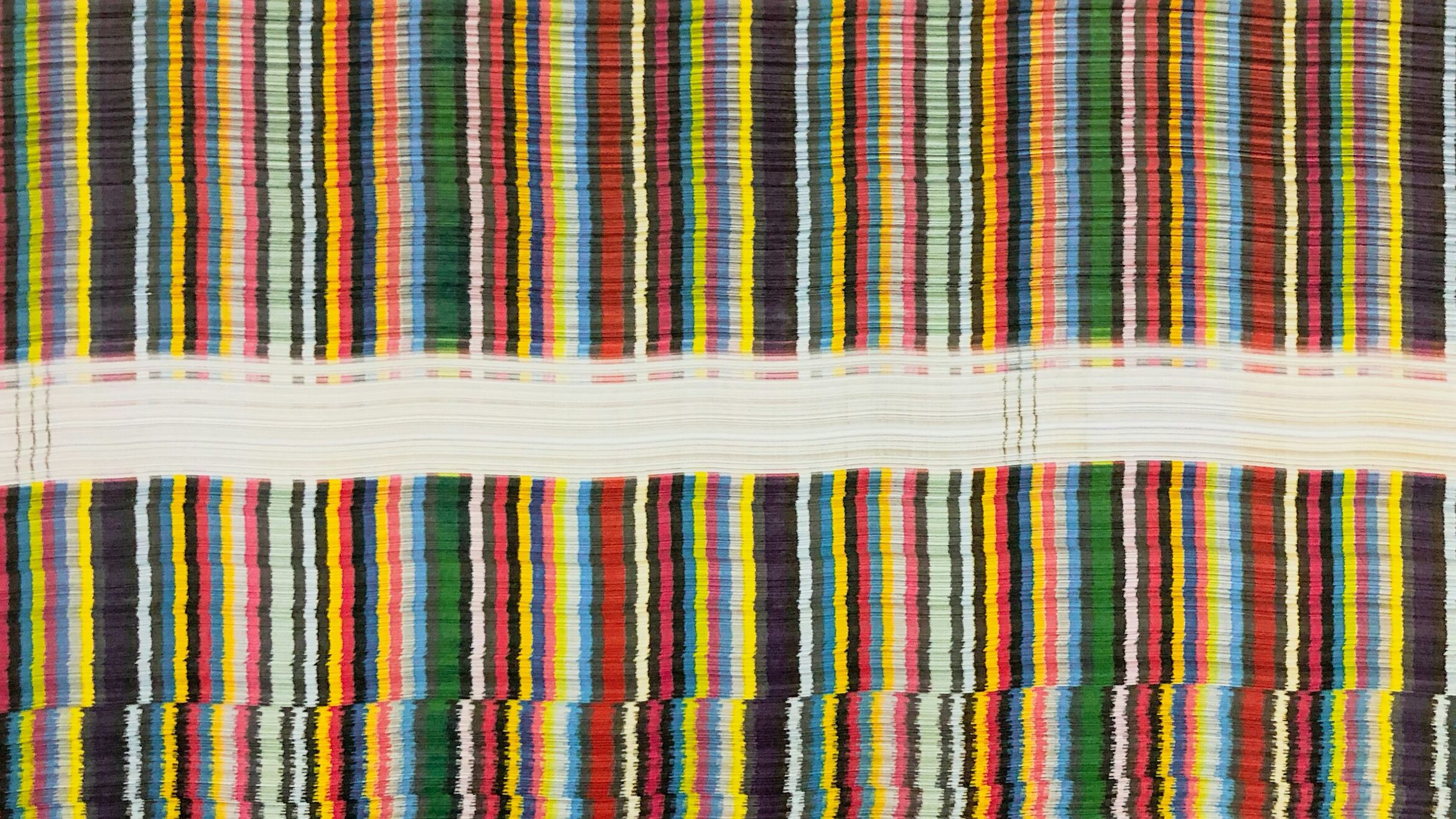
The impact of a color can be significantly influenced by its surrounding colors. A bright yellow might appear bold against a white background, but subdued when placed next to a vibrant orange. Experimenting with different color combinations allows you to fine-tune the emotional response each color evokes within your UI.
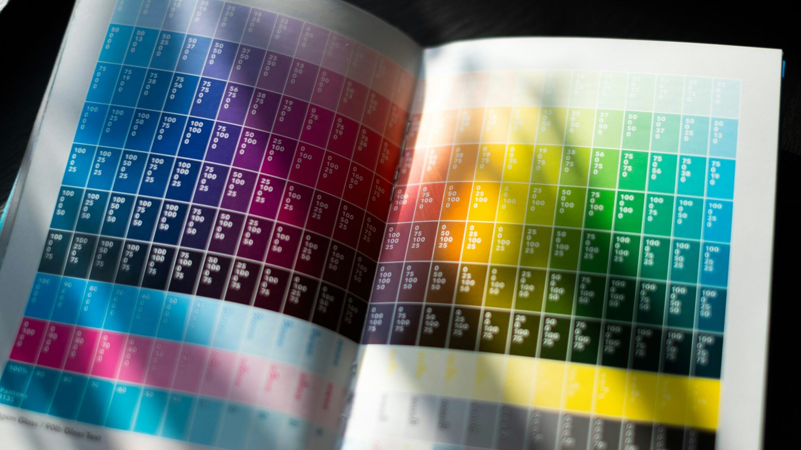
The Power of Saturation and Brightness
Accessibility Beyond Contrast
While ensuring adequate contrast between text and background colors is crucial, accessibility goes beyond that. Consider users with color blindness or visual impairments. Employing clear hierarchy and avoiding reliance solely on color for conveying information are essential aspects of accessible UI design.
The Science Behind Color Perception
The human eye perceives color through a complex interplay of light receptors (cones and rods) in the retina. Understanding these biological mechanisms can be beneficial for UI designers. For instance, cones are more sensitive to specific colors in daylight, which can inform your choices for daytime interfaces.
The Role of Color in User Experience (UX)
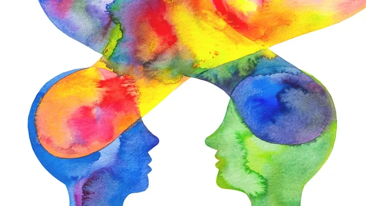
Color transcends mere aesthetics; it acts as a powerhouse for user experience (UX). A thoughtfully selected color palette can significantly enhance usability. How? By making navigation intuitive, drawing users’ attention to crucial elements, and establishing a visually organized layout. Conversely, a poorly chosen palette can trigger confusion and frustration.
The Psychology of Color Combinations
Just as individual colors evoke emotions, specific color combinations can create unique psychological effects. For example, a blue and green combination might suggest trust and growth, ideal for a financial services app. Conversely, a red and black combination might imply urgency and power, suitable for a high-stakes gaming platform.
The Impact of Color on Memory and Recognition
Color plays a significant role in brand recognition and memorability. By consistently using a defined color palette across your UI and marketing materials, you can create a distinct brand identity that users can easily recall. Think of the iconic red of Coca-Cola or the calming blue of Facebook.
Color Trends and the Passage of Time
While staying updated on color trends can be inspiring, it’s crucial to find a balance. Chasing fleeting trends might lead to a design that feels dated quickly. It’s better to prioritize a timeless color palette that aligns with your brand identity, with subtle nods to current trends for a refresh.
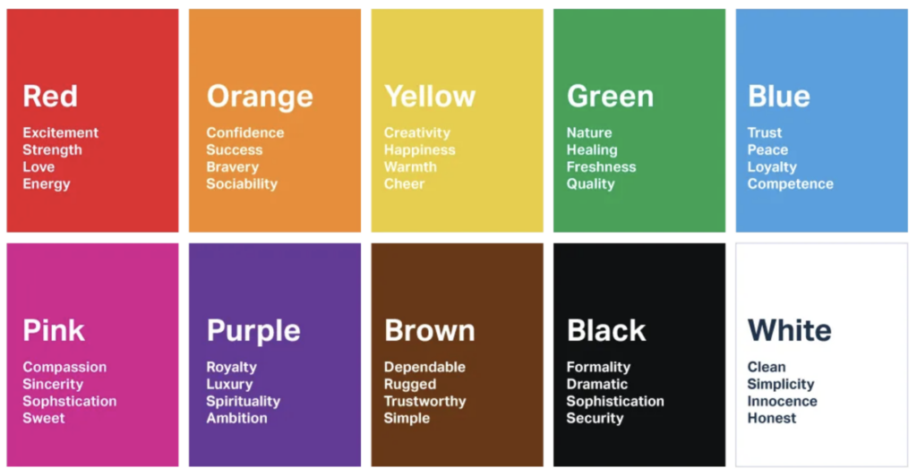
The Emotional Weight of Color
Colors carry emotional baggage. Understanding these emotional associations can be invaluable for UI designers. For instance, purple is often linked to luxury and sophistication, while brown evokes feelings of comfort and stability. By tapping into these emotions, you can create a UI that resonates with your target audience on a deeper level.
The Influence of Cultural Background
As mentioned before, color meanings can vary significantly across cultures. Consider a global audience – a green that signifies wealth in one culture might represent misfortune in another. Researching cultural color associations is essential for creating a UI design that avoids unintentional faux pas.
Color and Information Hierarchy
Color can be used to establish a clear hierarchy of information within your UI. By using brighter or more saturated colors for important elements, you can guide users’ attention and ensure they prioritize essential information. This is particularly crucial for complex interfaces with a lot of data to display.
The Power of Negative Space
Negative space, the empty space between elements in your UI, is just as important as the colors you use. Using color strategically within negative space can create visual breathing room or emphasize specific elements. For instance, a bold CTA button placed against a large area of negative space will naturally draw the user’s eye.
The Art of Storytelling Through Color
Color storytelling goes beyond simply evoking emotions. By crafting a color palette that tells a cohesive story about your brand, you can create a more immersive and engaging user experience. A nature-inspired app might utilize calming greens and blues, while a fitness app might incorporate energetic reds and oranges.
The Nuances of Color Naming
There’s more to color names than meets the eye. Subtle variations in a seemingly basic color can have a significant impact on perception. For instance, a “sky blue” evokes a different feeling than a “royal blue,” even though they might be visually quite similar. Choosing evocative color names for your design elements can enhance user understanding and create a more nuanced experience.
The Role of Color in Microinteractions
Microinteractions are the subtle animations and feedback cues that occur within a UI. Color plays a crucial role in making these microinteractions effective. For instance, a button might change color slightly on hover to indicate interactivity, or a success message might display in a green to visually communicate positive feedback.
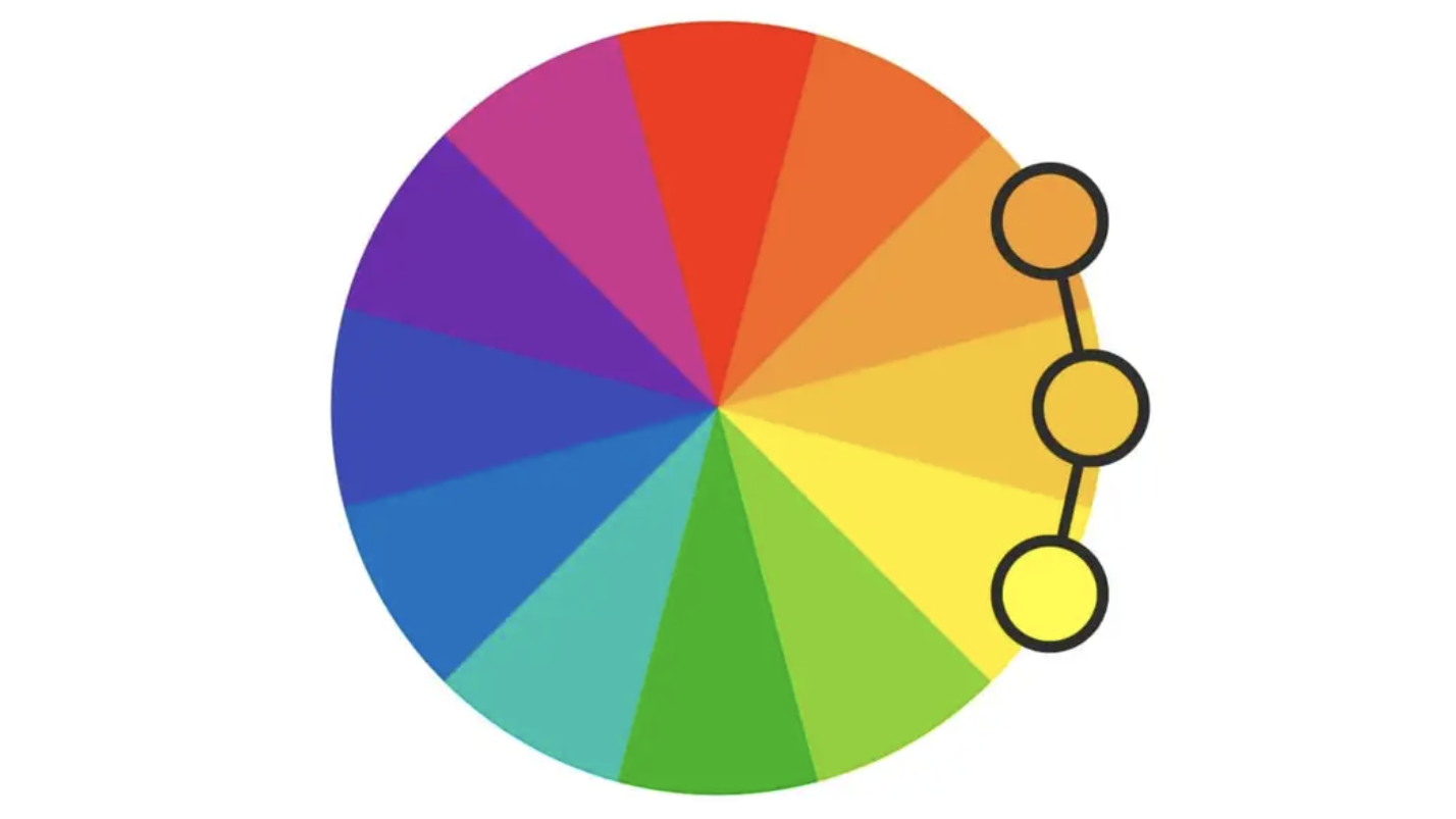
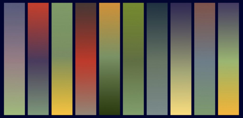
The Allure of Analogous Color Palettes
Analogous color palettes, consisting of colors next to each other on the color wheel, offer a sense of harmony and tranquility. They’re well-suited for creating calming and visually cohesive interfaces. Think of a weather app that utilizes a palette of blues and greens to evoke a sense of peace and nature.
The Energy of Complementary Color Palettes
Complementary color palettes, featuring colors opposite each other on the color wheel, create a high-contrast and dynamic feel. They can be effective for grabbing attention or highlighting important elements. However, use them judiciously to avoid overwhelming users. A fitness app might leverage a complementary orange and blue palette to inject energy and encourage action.
The Intrigue of Split-Complementary Color Palettes
Split-complementary palettes offer a balance between the harmony of analogous schemes and the contrast of complementary ones. They involve a base color and the two colors on either side of its complementary color. This approach creates a visually interesting palette that’s still balanced and pleasing to the eye. A travel website might utilize a split-complementary palette with a teal base, orange, and purple accents, evoking a sense of wanderlust and exploration.
The Vibrancy of Triadic Color Palettes
Triadic color palettes, formed by three colors evenly spaced on the color wheel, offer a vibrant and stimulating feel. They’re ideal for creating engaging and visually dynamic interfaces. However, ensure proper balance to avoid a chaotic appearance. A children’s learning app might benefit from a triadic palette with yellow, blue, and red, fostering a playful and stimulating environment.
The Duality of Monochromatic Color Palettes
Monochromatic color palettes, built upon variations of a single hue with tints, shades, and tones, achieve a clean and sophisticated look. These palettes are ideally suited for minimalist UIs or interfaces that prioritize readability. For example, a luxury fashion brand’s website might leverage a monochromatic palette of black and grays, thereby exuding elegance and refinement.
By delving into these nuances of color theory, UI designers can elevate their craft and create interfaces that are not only visually appealing but also communicate effectively with users on a deeper level. Remember, color is a powerful language, and mastering its subtleties allows you to craft truly impactful UI experiences.
- Color Harmony: Let’s explore different harmony schemes to achieve the effect you desire. Analogous color palettes, which feature colors positioned side-by-side on the color wheel, naturally evoke a sense of tranquility. This makes them perfect for creating calming and visually cohesive interfaces. Imagine a weather app that leverages a palette of soothing blues and calming greens. This combination effectively evokes a sense of peace and connection to nature.
- Contrast: To ensure optimal readability, make sure there’s enough contrast between text and background colors. Strive for a balance that avoids straining users’ eyes. A handy rule of thumb is to utilize a color contrast checker tool. This will guarantee a WCAG (Web Content Accessibility Guidelines) compliant contrast ratio.
- Design Conventions: Consider established design conventions, such as using dark text on a light background and employing standard call-to-action colors (e.g., red for warnings, green for success messages). While some experimentation is encouraged, adhering to these conventions can enhance user experience by creating a sense of familiarity and intuitive navigation.
- User Testing: Validate your color choices through user testing. Gather feedback to ensure your color palette resonates with your target audience. User testing allows you to identify any potential issues with color combinations or legibility before finalizing your design.
Beyond the Basics: Advanced Techniques for Mastering Color
Once you’ve grasped the fundamentals, there’s a whole world of advanced color techniques waiting to be explored:
- Color Gradients: Transitioning smoothly between colors can significantly enhance the depth and visual interest of your UI. For instance, imagine a website banner that starts with a vibrant orange that gradually blends into a calming blue. This color shift creates a sense of movement and dynamism, engaging users and drawing them in.
- Color Overlays: Furthermore, layering transparent colors can create a unique and stylish effect. For instance, imagine a design that utilizes a semi-transparent blue overlay applied on top of a background image. This approach not only adds a subtle touch of coolness to the image, but it also does so without obscuring its details.
- Desaturation: Reducing the saturation of colors can create a more muted and calming palette. Imagine a social media app that utilizes a desaturated pink for its logo, offering a gentler and more approachable aesthetic compared to a highly saturated pink.
The Nuances of Color: Exploring the Depths of Color Theory
The impact of a color can be significantly influenced by its surrounding colors. A bright yellow might appear bold against a white background, but subdued when placed next to a vibrant orange. Experimenting with different color combinations allows you to fine-tune the emotional response each color evokes within your UI.
The human eye perceives color through a complex interplay of light receptors (cones and rods) in the retina. Understanding these biological mechanisms can be beneficial for UI designers. For instance, cones are more sensitive to specific colors in daylight, which can inform your choices for daytime interfaces.
Color and Information Accessibility
While ensuring adequate contrast between text and background colors is crucial, accessibility goes beyond that. Consider users with color blindness or visual impairments. Employing clear hierarchy and avoiding reliance solely on color for conveying information are essential aspects of accessible UI design. Tools like color contrast checkers and designing for different forms of color blindness can ensure your design is inclusive for all users.
The Role of Color in Storytelling with Design
Color can be a powerful storytelling tool in UI design. By crafting a color palette that evokes specific emotions and imagery, you can create a more immersive and engaging user experience. A travel website might use a palette of blues and greens to evoke a sense of wanderlust and tranquility, while a gaming website might employ a bolder palette with reds and oranges to create an atmosphere of excitement and action.
Color Trends and the Passage of Time
While staying updated on color trends can be inspiring, it’s crucial to find a balance. Chasing fleeting trends might lead to a design that feels dated quickly. It’s better to prioritize a timeless color palette that aligns with your brand identity, with subtle nods to current trends for a refresh.

The Future of Color Theory
The Rise of User-Generated Color Palettes
Furthermore, as user participation in design increases, a fascinating trend is emerging: user-generated color palettes. Crowdsourcing platforms empower designers to directly tap into the collective creativity of users. This collaboration generates unique and unexpected color combinations that traditional methods might miss. The result? More dynamic and user-centric UI experiences. Imagine a social media campaign where users can actively vote on color palettes for a new feature. This approach not only fosters a sense of community but also cultivates a feeling of ownership among users, making them more invested in the final product.
Accessibility Beyond WCAG Standards
The Web Content Accessibility Guidelines (WCAG) set the minimum standards for accessible color contrast. However, future-oriented UI designers will likely consider a broader range of accessibility factors related to color. This might involve incorporating features like colorblind-friendly mode options or allowing users to customize color contrast settings for a more personalized experience.
The Influence of Augmented Reality (AR) and Virtual Reality (VR)
The rise of AR and VR technologies introduces new considerations for color theory. As users interact with interfaces in three-dimensional spaces, color choices will need to factor in lighting conditions, depth perception, and the overall immersive experience. Understanding how colors interact in these environments will be crucial for crafting effective UI designs for the future. Imagine a VR game where the color temperature of the environment dynamically adjusts based on the player’s actions, creating a more responsive and engaging experience.
The Integration of Artificial Intelligence (AI) in Color Selection
Furthermore, AI-powered design tools are rapidly becoming more sophisticated. In the coming years, AI might actively assist designers in selecting color palettes based on a multitude of factors. These factors could include target audience demographics, user behavior data, and even prevailing design trends. This could significantly streamline the design process and potentially lead to more data-driven color choices. Imagine an AI tool that analyzes user engagement data from a website and then proposes color palette tweaks that might improve conversion rates.
The Importance of Sustainability in Color Choices
As environmental consciousness grows, the concept of sustainable UI design is gaining momentum. This might involve considering the environmental impact of the colors used in digital products. For instance, some colors require more energy to display on screens, and designers might favor more energy-efficient color choices in the future. Additionally, exploring color palettes that utilize natural color inspiration can contribute to a more sustainable design approach.
The Exploration of Haptic Feedback and Color
Furthermore, the future of UI design might involve a deeper integration of multiple senses. In this scenario, haptic feedback – which provides users with tactile sensations through their devices – could be combined with color to create even more immersive and interactive experiences. Imagine a button that changes color and provides a subtle vibration on touch. This would create a richer user experience that leverages both visual and tactile cues, enhancing user engagement in a way that wasn’t previously possible.
The Evolution of Color Theory Education
As technology surges forward and design practices transform, color theory education will undoubtedly need to adapt as well. Consequently, educational institutions might introduce new modules that delve into color theory for AR/VR interfaces, user-generated palettes, and the ethical considerations surrounding color choices in a sustainable future. Equipping future designers with a comprehensive grasp of color theory in this ever-evolving landscape will be paramount to their success.
By staying informed about these emerging trends and actively exploring the possibilities, UI designers can ensure their color theory knowledge remains future-proof. Remember, color is a dynamic force in design, and embracing its ever-evolving nature will lead to the creation of truly groundbreaking user interfaces that are not only aesthetically pleasing but also user-centric, accessible, and sustainable.
Conclusion: Mastering the Art of Color
As you embark on your design journey, the vast and ever-expanding universe of color theory awaits exploration. Delving into its core principles will unlock a deeper understanding of color psychology. This knowledge, coupled with experimentation with various techniques, empowers you to elevate your design projects. Remember, color transcends mere aesthetics; it’s a powerful language that can shape user experience, evoke emotions, and weave compelling stories. Through color, your designs can blossom into vibrant expressions of both creativity and functionality.
As you embark on your design journey, embrace the limitless possibilities that color offers. Whether you’re crafting a user interface, developing a brand identity, or simply beautifying a physical space, wield the power of color with both intention and creativity. By understanding its nuances and staying informed about emerging trends, you can transform your designs from good to great, leaving a lasting impact on your audience.
Related Posts:
Using White Space in UX Design: More Than Just Empty Space
The Power of Microinteractions in UX Design
Dive into Dark Mode, A Game Changer
The Aesthetic-Usability Effect: Balancing Beauty and Functionality in UX Design
Unveiling the Magic: UI vs. UX Design