The design of your homepage is one of the most critical aspects of your website. It’s the first thing visitors see and, as the saying goes, you never get a second chance to make a first impression. In fact, 75% of users judge a company’s credibility based on its website design. If your homepage falls short, you risk losing potential customers before they even begin to explore your offerings. Avoiding common homepage design mistakes is essential for creating a site that not only looks good but also performs well.

1. Ignoring Accessibility
One of the biggest mistakes in homepage design is neglecting accessibility. A website that isn’t accessible excludes a significant portion of your audience, particularly those with disabilities. This isn’t just a social issue; it’s also a legal and business one. Websites that fail to meet accessibility standards can face legal repercussions and miss out on potential customers.
Insufficient Color Contrast
Color contrast is vital for readability. If the text on your website blends too much with the background, it becomes difficult to read, especially for those with visual impairments such as color blindness. A significant number of websites fail in this area; according to the 2022 WebAIM Million report, over 80% of homepages had color contrast issues. To address this, use tools like contrast checkers to ensure your text stands out clearly against your background.
Missing or Inappropriate Alt Text
Alternative text (alt text) for images is crucial for accessibility, especially for users who rely on screen readers. Alt text describes the content of an image, allowing visually impaired users to understand its context. When alt text is missing or inadequately describes the image, it alienates a portion of your audience. Ensure that every image on your homepage has descriptive and meaningful alt text that conveys the same information as the image itself.
Inadequate Visual Focus Indicators
Focus indicators, such as outlines around clickable elements, help users who navigate your site using a keyboard. Without these indicators, users can easily lose track of their navigation path, making your site less user-friendly. Make sure your homepage clearly highlights interactive elements when they are focused, enhancing usability for all visitors.
Overlooking Accessible Labels
If your site relies heavily on visual cues, it’s essential to provide accessible labels for assistive technologies. For instance, “Read More” buttons should be labeled clearly with the context, such as “Read More About Our Services,” to help screen reader users understand the content. This attention to detail ensures your site is usable by everyone, regardless of how they access it.
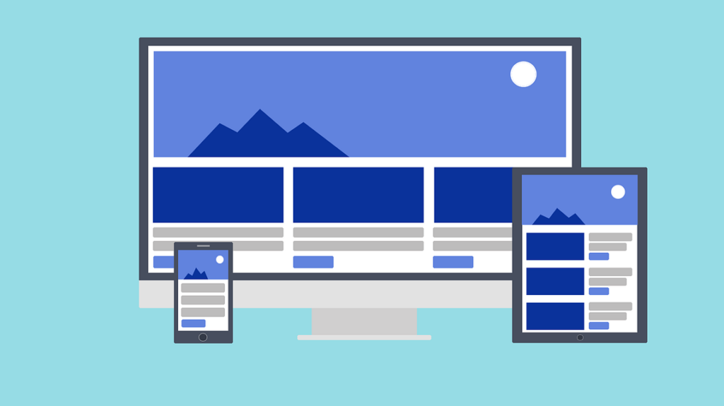
2. Neglecting Responsive Design
In today’s multi-device world, responsive design is no longer optional. With mobile devices accounting for over 58% of global web traffic, a website that isn’t optimized for all screen sizes risks frustrating users and increasing bounce rates.
Responsive design means your website adapts seamlessly to different screen sizes, ensuring a consistent user experience across devices. This adaptability is crucial for retaining visitors and keeping them engaged with your content.
To ensure your homepage is responsive, use flexible grid layouts and scalable images. Test your site on various devices to spot potential issues and optimize the user experience accordingly. Tools like Google’s Mobile-Friendly Test can help you evaluate how well your site performs on mobile.

3. Prioritizing Aesthetics Over User Experience
While a visually stunning website can capture attention, it should not come at the expense of functionality. A common mistake in homepage design is placing too much emphasis on aesthetics, leading to a site that looks great but is difficult to navigate.
Overuse of Animation and Graphics
Excessive use of animations, videos, and heavy graphics can slow down your website and distract users from the main message. While these elements can enhance the visual appeal, they should be used sparingly and strategically. Ensure that every design choice serves a purpose and contributes to the overall user experience.
Trend-Driven Design Choices
Following design trends can be tempting, but it’s essential to strike a balance. Trends come and go, and what’s popular today might feel outdated tomorrow. Instead of blindly following trends, focus on creating a timeless design that aligns with your brand’s identity and user needs. This approach ensures your website remains relevant and effective over time.
4. Failing to Customize
Your homepage should reflect your brand’s unique identity. Relying too heavily on generic templates without customization can result in a site that feels impersonal and indistinguishable from competitors.
The Pitfalls of Cookie-Cutter Templates
While templates offer a quick and easy way to build a website, they often lack the unique touch that sets your brand apart. To avoid this, invest time in customizing your homepage design. This could mean using custom graphics, tweaking the layout to better suit your content, or incorporating your brand’s color palette and typography.
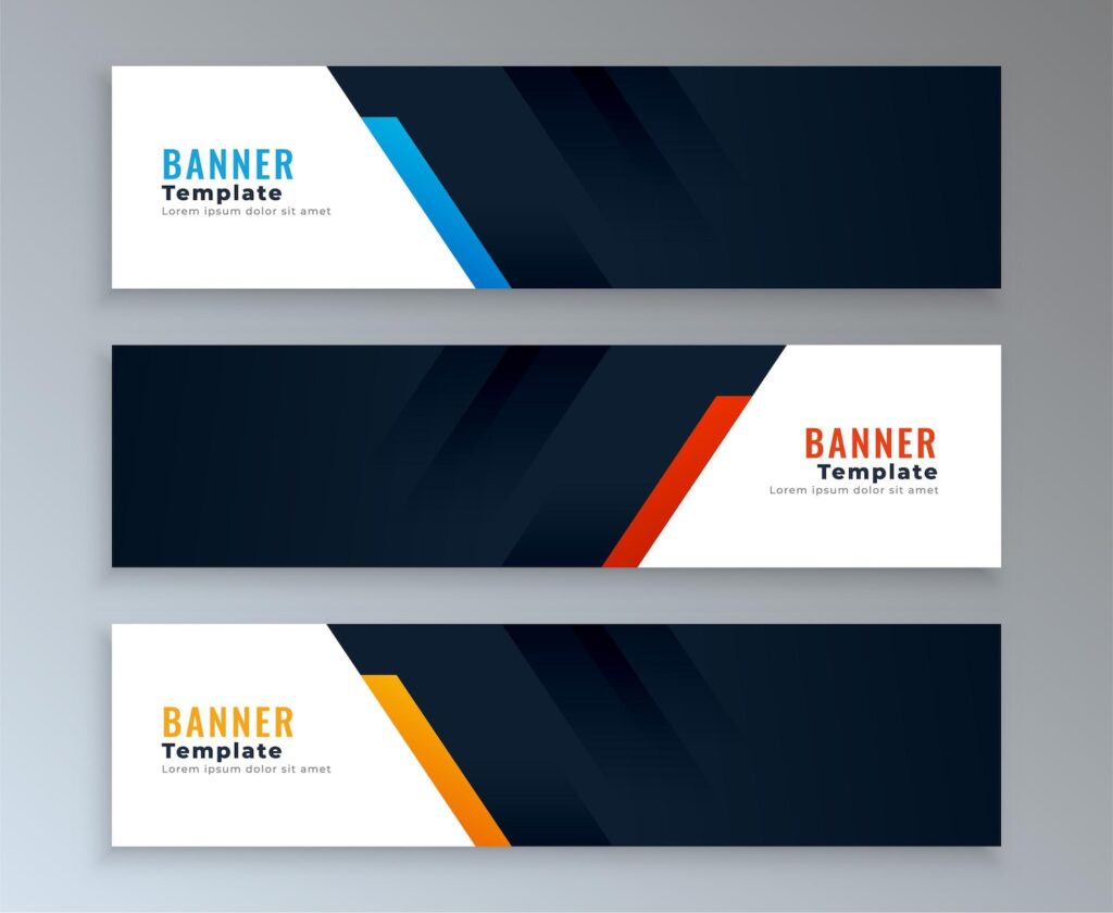
Using Generic Hero Banners
The hero banner, typically a large image or video at the top of the homepage, is a popular design element. However, its overuse has led to a formulaic approach that can feel stale. Instead of defaulting to this common design, think creatively about how to present your most important content. Consider using a different layout or incorporating interactive elements that engage users from the moment they land on your site.
5. Incorporating Ineffective Features
A homepage cluttered with features that don’t convert can confuse users and detract from your site’s overall effectiveness.
The Carousel Dilemma
Rotating carousels or sliders are a common feature on many homepages, but studies have shown that they are often ignored by users, especially on mobile devices. If you choose to use a carousel, ensure that the most important content is on the first slide and that controls are easily accessible. However, it might be more effective to highlight key content in a static, easily navigable format.
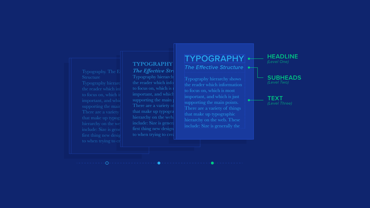
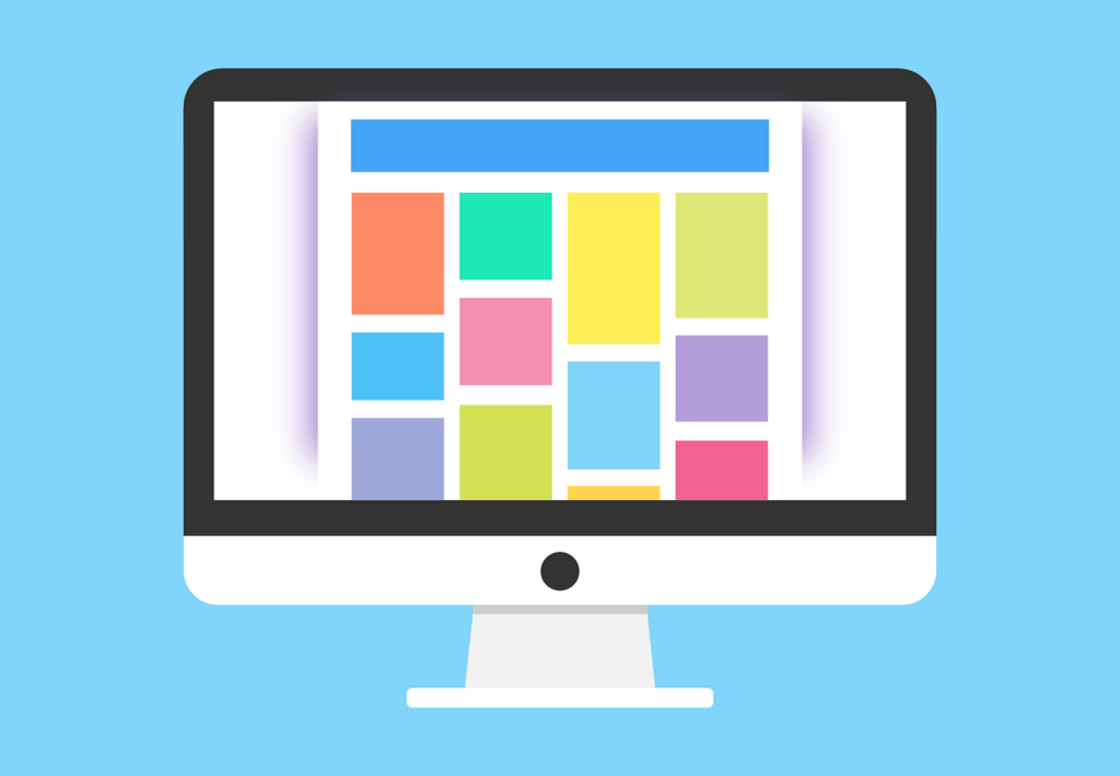
6. Lack of Visual Hierarchy
A homepage without a clear visual hierarchy can overwhelm visitors, making it difficult for them to know where to focus their attention. A well-structured hierarchy guides users through your content in a logical and intuitive way.
Importance of Typography and Layout
Just as newspapers use headlines and subheadings to organize information, your website should use typography and layout to establish a clear hierarchy. Use larger fonts for headings and subheadings, and consider how the placement of elements on the page can guide the user’s eye. This structure not only improves readability but also helps users quickly find the information they’re looking for.
Utilizing White Space
White space, or negative space, is the area of a page left unmarked. It’s a powerful tool in homepage design that helps create a clean, uncluttered look. By giving elements on your page room to breathe, you can emphasize important content and improve the overall user experience.
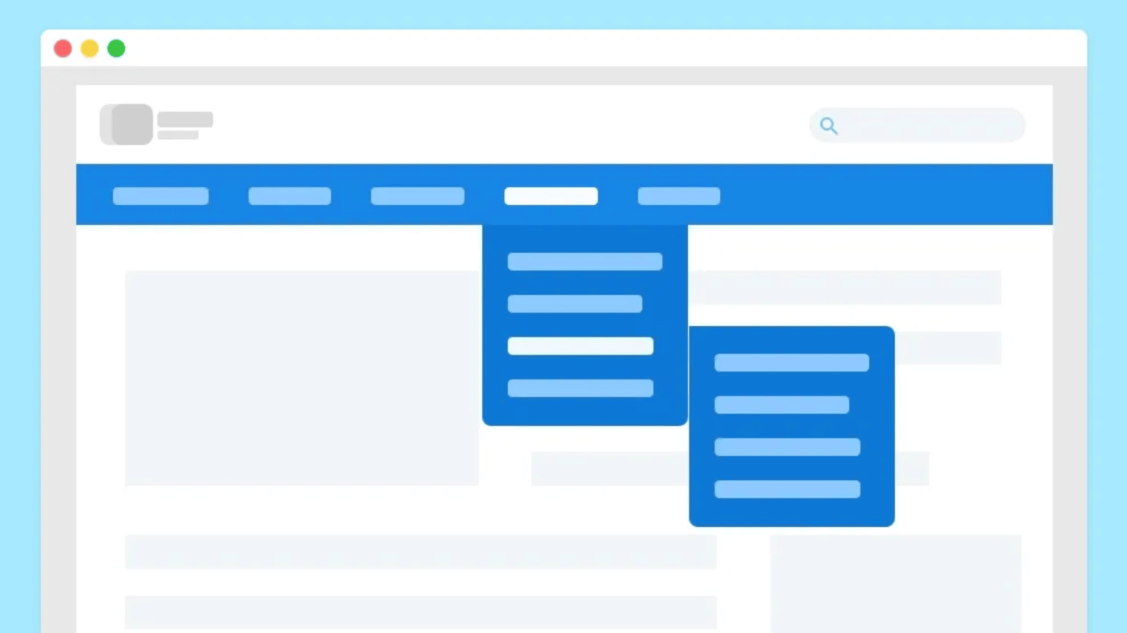
7. Unclear Navigation
Navigation is a critical aspect of website design. If users can’t easily find what they’re looking for, they’ll quickly leave your site.
Designing Intuitive Navigation Menus
Your navigation menu should be simple and intuitive. Avoid overloading it with too many options, and use clear, descriptive labels that accurately reflect the content of each page. The “three-click rule” is a useful guideline: users should be able to find what they’re looking for within three clicks.
Ensuring Consistency Across Devices
Navigation should be consistent across all devices. Test your site on different screen sizes to ensure that menus are easy to access and use, whether on a desktop, tablet, or smartphone. Consistent navigation not only improves usability but also builds trust with your audience.

8. Poor Communication of Business Purpose
When visitors arrive on your homepage, they should immediately understand what your business does. Failing to clearly communicate your business purpose can lead to confusion and lost opportunities.
Crafting a Clear Value Proposition
Your value proposition should be front and center on your homepage, preferably above the fold. It should clearly state what your company offers and why it’s better than the competition. Accompany this with a strong call-to-action (CTA) that guides users toward the next step, whether that’s learning more about your services, signing up for a newsletter, or making a purchase.
Balancing Copy and Visuals
While visuals are important for capturing attention, they should complement rather than overshadow your messaging. Use images and videos to support your copy, but ensure that the primary message is conveyed clearly through text. This balance helps visitors quickly grasp the essence of your business.

9. Weak Calls-to-Action (CTAs)
Your homepage should guide visitors toward specific actions, such as signing up for a service or making a purchase. Weak or unclear CTAs can result in missed conversions and reduced user engagement.
Designing Effective CTAs
Effective CTAs are clear, concise, and compelling. They should stand out on the page, using contrasting colors and bold text to catch the user’s eye. The language should be action-oriented, encouraging users to take the next step. For example, instead of a generic “Click Here,” use specific language like “Start Your Free Trial” or “Get Your Free Quote.”
Placing CTAs Strategically
The placement of CTAs is just as important as their design. They should be positioned in prominent locations on your homepage, such as at the end of sections or in the top right corner of the page. Make sure they are easily accessible and visible, so users don’t have to search for them.
10. Overloading with Too Many Elements
A cluttered homepage can overwhelm users and make it difficult for them to find what they’re looking for. Simplicity and clarity are key to a successful homepage design.
Streamlining Your Layout
To avoid clutter, prioritize the most important elements on your homepage and remove anything that doesn’t serve a clear purpose. Use a clean, simple layout that directs users’ attention to the most critical content. This might mean limiting the number of images, reducing the amount of text, or simplifying navigation options.
Focusing on Quality Over Quantity
When it comes to homepage design, less is often more. Instead of trying to include everything, focus on delivering high-quality content that resonates with your audience. This approach not only improves the user experience but also makes your site more effective in achieving its goals.
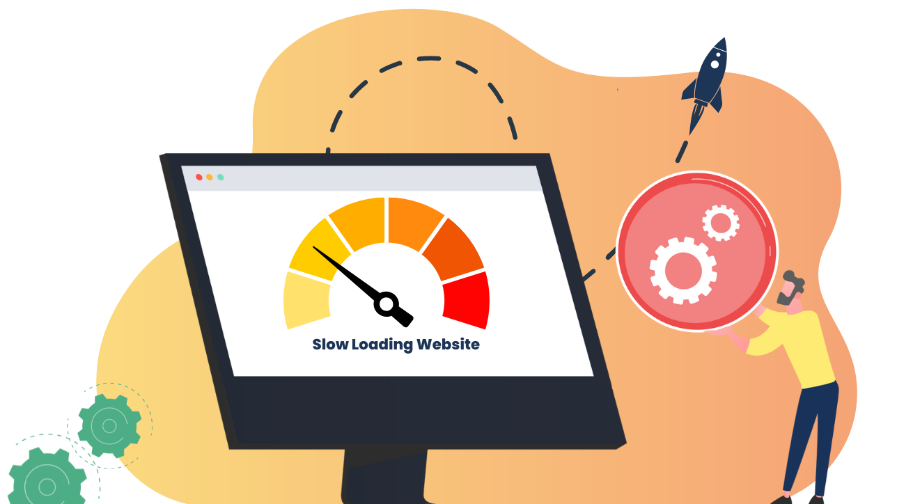
11. Poor Performance and Loading Speed
No matter how well-designed your homepage is, if it doesn’t load quickly, you’ll lose visitors. Slow loading times are one of the top reasons users abandon websites.
Optimizing for Speed
Ensure your homepage loads quickly by optimizing images, leveraging browser caching, and minimizing HTTP requests. Tools like Google PageSpeed Insights can help you identify areas where your site is lagging and offer recommendations for improvement.
12. Failing to Test and Iterate
Websites are not static; they need regular updates and testing to remain effective. Failing to test your homepage design can lead to missed opportunities for optimization.
A/B Testing and User Feedback
Use A/B testing to compare different versions of your homepage and see which performs better. Collect user feedback to understand how visitors are interacting with your site and where there might be pain points. This iterative approach allows you to make data-driven decisions that enhance your homepage over time.

Conclusion
Your homepage is the gateway to your website and, by extension, to your business. Avoiding these common design mistakes and following best practices can make a significant difference in how visitors perceive your brand and engage with your content. From accessibility and responsive design to clear communication and user-friendly navigation, each aspect of your homepage plays a vital role in creating a successful online presence.
Remember, the key to a great homepage is not just about looking good, but also about delivering an experience that resonates with users and meets their needs. By focusing on usability, clarity, and performance, you can create a homepage that not only attracts visitors but also converts them into loyal customers.
Related Posts:
Using White Space in UX Design: More Than Just Empty Space
Mastering Typography in UX/UI Design
The Aesthetic-Usability Effect: Balancing Beauty and Functionality in UX Design
Accessibility in UX: Designing for All Users
Comprehensive Guide to Responsive Design